

Can you introduce us to Kollektiv Collective, when it was founded, and what the agenda behind it is?
Kollektiv Collective: We founded Kollektiv Collective in 2019 after having collaborated on our first joint exhibition at the Swiss Church, London. From the outset, our interest in the politics of space, both conceptually and architecturally speaking, became the starting point for our curatorial methodology of site-specificity. The nomadic structure of our practice allows us to work within various institutional frameworks, in London and internationally, where we develop each exhibition with and against a given space and context. Our approach is rooted in decentralized structures, foregrounding collective authorship, multiplicity, friction, and care, and imagining modes of being that challenge dominant frameworks. Our process-led curatorial research further extends into our writing practice, having previously published essays on urban studies, artistic production, and language.


Verena, could you also tell us more about the Wilhelm Traeger Estate and how it has been operating since its founding?
Verena Traeger: Wilhelm Traeger‘s estate is located in Vienna. Since the artist died in 1980, we have been promoting his artwork. The collection includes socio-critical artworks, like the series Wien 1932, 40 linoleum cuts that create a portrait of the ethically and economically ruined Viennese metropolis between the two world wars; apocalyptic graphic arts like the „Death Dance“ series before and after World War II; oil paintings, watercolors, mixed media, and, since the 1960s, collages on cardboard and later on wooden plates. The posthumous solo exhibitions include the comprehensive retrospective Wilhelm Traeger (1907–1980), Wien Fredericia–Ried in 1998 in the Museum Jorn in Silkeborg, Denmark. Since 1982, my father’s artworks of the interwar period have been displayed in several important exhibitions in Vienna (Belvedere, Leopold Museum, Wien Museum, Kunstforum, and the MAK—Museum für angewandte Kunst, Wien), in Berlin (Berlinische Galerie), in Bregenz (Vorarlberg Museum), and in 2018 at the Neue Galerie in New York, but now in London the focus is on his collages. While in the show „Before the Fall“ in the Neue Galerie in New York, curator Olaf Peters especially juxtaposed my father‘s linoleum cuts from 1932 with graphic artworks by Max Beckmann. The London-based curatorial team Kollektiv Collective (Sasha Shevchenko and Pia Zeitzen) has set up „Of course I know eternity“ as a unique artistic dialogue between my father‘s collages from the 1960s and the site-specific artworks by contemporary multimedia artist Gray Wielebinski.

How did you meet with Gray? What was the starting point for this collaboration?
Kollektiv Collective: We can speak to that from the curatorial side. We were commissioned by the Austrian Cultural Forum to develop an exhibition that would create a dialogue between the Austrian postwar avant-garde and a contemporary artist’s position. We started looking into Wilhelm Traeger’s work, and it opened up a lot of really urgent and relevant themes, especially about how we process history, particularly the legacy of the world wars, and how that continues to or fails to inform our ideas of humanity today.
We’d been following Gray’s work for a while already, and saw clear resonance. We believed that a conversation between Traeger’s collages and Gray’s practice would reveal both continuity and difference, showcasing different positions within vantage points on interlinked themes. Also, there was an interesting overlap in how both artists use materials and media, especially their shared interest in collage. So we reached out to Gray, and we were very lucky that he was available and open to collaborating.

Gray Wielebinski: Yes, from my side, it was a generous and thoughtful proposal. As an artist, you can tell when someone has done the work and when there’s actual engagement. I felt that right away from Pia and Sasha. What excited me most was the chance to work with a strong curatorial prompt, to respond to something thoughtfully, and to do that in a site-specific and collaborative way. The space of the Austrian Cultural Forum where the exhibition “Of course I know eternity” takes place is very unique. And working not only with curators but also with the work of another artist from a different generation, one tied to such a complex, politically charged era, it was all very compelling.
The title of the exhibition is wonderful. Can you tell us how it came about?
Kollektiv Collective: It came out of one of the calls we had all together. We visited Gray’s studio at Somerset House, and Verena joined us from Vienna. We were taking shorthand notes, jotting down ideas as we spoke. It was one of those moments of ‘hypercommunication.’ We were all so immersed in the discussion, talking about Wilhelm’s life, her relationship to him, the work, everything. And at some point, were missing an English word, so we translated. The word was „Ewigkeit“ so eternity in English. Oh, it’s eternity.” As we filled in the gap, Verena paused and then said, “Oh, of course I know eternity.” There was something beautiful and disarming about that moment. We all kind of latched onto it.
The title reflects the kind of collaboration we were doing: multilingual, cross-cultural, and cross-generational. We all spoke English, it isn’t most of our first language, so there was always this question of meeting in the middle, of translation, of generosity.

Gray Wielebinski: Yeah, it was simple but layered, a kind of linguistic slippage, a moment of humility, clarity, miscommunication, and connection. That became the title: Of course I know eternity.
Were you already familiar with Traeger’s work prior to this project?
Gray Wielebinski: Only vaguely. I’d seen some of his prints; that’s what I was more familiar with, especially because my background is also in printmaking and bookmaking. But I hadn’t seen the collages before, and they drew me in. They’re so fascinating, especially for me, because I am deeply interested in collage not just as a medium but as a methodology. That kind of cut-and-paste logic is integral to how I think and work. So the invitation to respond to Traeger’s collages felt immediately relevant; it pushed me in new directions, especially sculpturally and spatially.
Kollektiv Collective: Similarly, for us, we didn’t know Traeger’s work before being asked by the ACF director to bring it to the UK. His life spanned a very difficult era, the wars, and then the 1960s, which is when the collages in the show were made (from 1961 to 1969). It was a moment of cultural opening and cautious optimism, but Traeger didn’t gain international recognition during his lifetime, partly due to those very circumstances. So it was a special opportunity for us to bring his voice into a new dialogue and to work with it despite never having met the artist.
What made it possible was the generous support of his daughter, Verena. She was absolutely wonderful, so open, trusting, and supportive. Through her, we could understand not just who Traeger was as an artist, but also how to form a relationship to his work and legacy. And honestly, our connection with her became a really meaningful part of the whole project.
Verena, how do you perceive the connections between Wielebinski’s work and the work of your father?
Verena Traeger: For me, the exhibition “Of course I know eternity” is a great adventure, and I know that my father would have loved it. From the outset, I was thrilled by the genius idea of the curatorial team, Sasha Shevchenko and Pia Zeitzen, to set up this unique artistic dialogue, and by Gray Wielebinski‘s courageous open-mindedness for this intergenerational art discourse. For me, the partly three-dimensional collage-like presentation culminates in the intertwined presentation of my father‘s collage Homage to Alfons Petzold centered in Wielebinsky‘s black stars to Infinity. Set against Wielebinski’s site-specific artworks, my father‘s collages from the 1960s feel as relevant as ever! The nuclear threat is more present than ever before; the space race has just shifted from the moon to Mars; the superpowers have become multiplied, and still, we only see the ones in the light, and we don’t see the ones in the darkness.
Could you share with us more about Wilhelm Traeger’s paper collages from 1961 to 1969, which are currently on view in the exhibition?
Verena Traeger: My father, Wilhelm Traeger (1907–1980), used to react like a seismograph to the disturbances of his time. In his collages, he responded directly to science-fiction-like events such as atomic bombs, the rearming during the Cold War between the superpowers USA and USSR, the space race between Soviet cosmonauts and American astronauts, and the unconditional belief in technology and progress. The optic mass overflow of brilliant luster pictures offered in posters and magazines like the US Life magazine gave him the materials to construct his figural collages.
The thirteen collages presented at the Austrian Cultural Forum in London, my father made between 1961 and 1969—both are important dates in the history of the space race. In 1961, Soviet cosmonaut Yuri Gagarin was the first man who saw the Earth as a „blue planet“ during his successful all-flight around the Earth, and in 1969, the US astronauts Neil Armstrong and Buzz Aldrin of the Apollo 11 mission became the first humans to set foot on the moon.
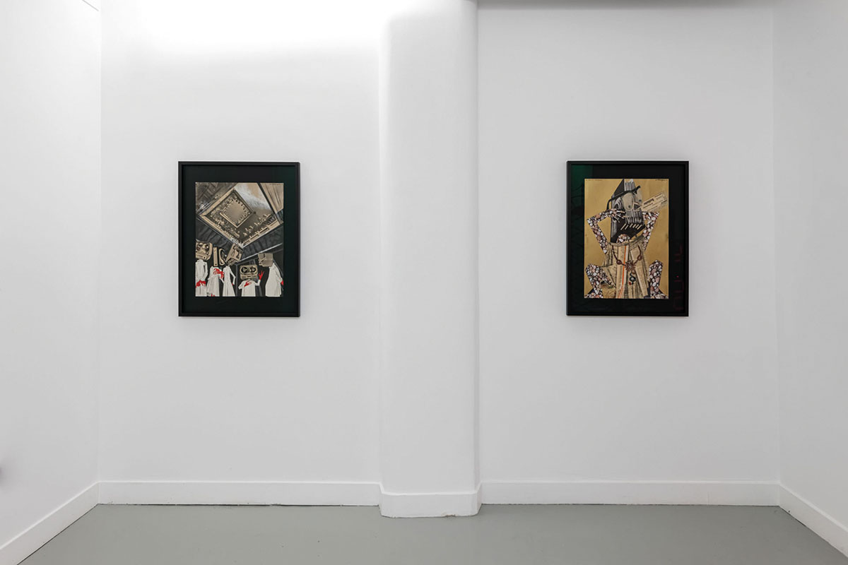
In his collages, my father used to combine poetry, humor, and warning, like in Homage to Alfons Petzold, where he relates directly to the poetry of the Viennese workers’ poet Alfons Maria Petzold (1882–1923), who lived around the turn of the 19th to the 20th century: „From the earthen dirt and poverty I am boarding as a human servant, in the boat of stars gladly travelling. I keep the steering straight ahead because I know, these days, that all the winds are blowing towards eternity.“ One can see here a father with his son in a tiny rowing boat who, like somnambulistic daydreamers, are traveling into eternity, while a hydrogen bomb, like the one at Bikini Atoll in 1946, explodes on the horizon.
In “The labyrinth of time” my father has included himself in the center of the maze, busy and occupied by making art under a canopy with dark holes, the so-called wormholes, which are like tunnels connecting far-away dimensions within the eternal universe. The many clocks that surround him are ticking and reminding us that time is running and life is not eternal at all.
“Design of a traffic memorial in New Sansara” is a kind of warning pole made of old cars, which reminds us of our own mortality. Sansara is a Sanskrit word for „constant wandering,“ which in Buddhism and Hinduism names the eternal circle of life, from birth to death.
“The Dream Path to Eternity,” mankind’s dream to fly, is paved by many inventions, and in the time of records, we see humans fighting for records.
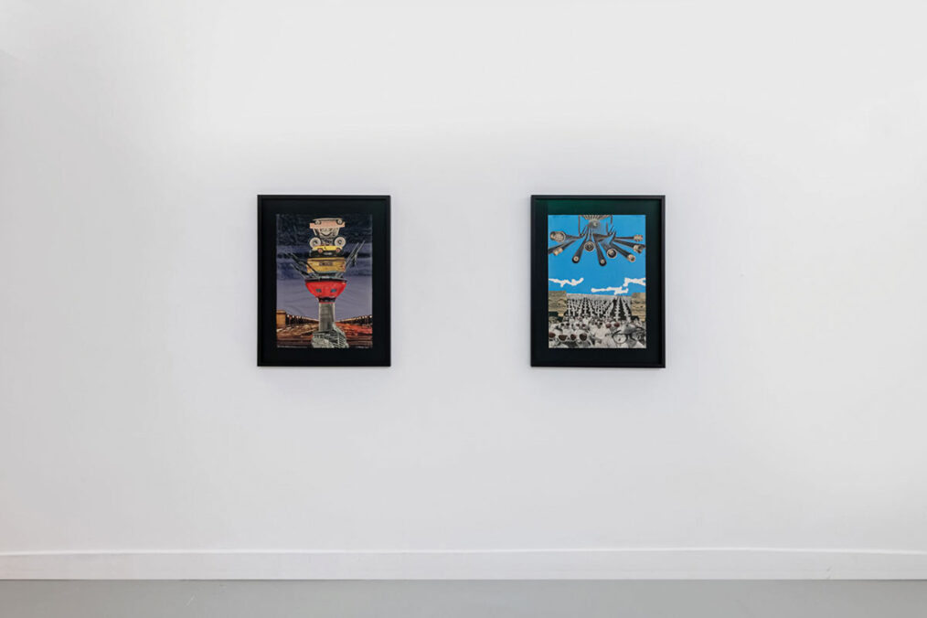
“We only see the ones in the light, and we don’t see the ones in the darkness” is a direct reference to Mack the Knife’s (Mackie Messer) moritat in Berthold Brecht’s Threepenny Opera. In the illusory world of fashionable, rich, and beautiful people, the ones outside the spotlights stay unseen in the shadows. Another metaphor of the unfairness in society and the privilege of single persons, who are famous and spotlighted, can be read in the collage. “All Humans are equal …? In “Spectrum MCLXIII” a group of people wearing rose-tinted glasses look up in delight before a background filled with graves of soldiers. One lone child in the crowd sees the world through clear glasses and wears a frown.
In “Adoration of False Gods a Volkswagen” becomes a godlike machine that people adore. After the Second World War, the car became a symbol of status and enabled intensive traffic. In “Council,” scientists or physicians dressed in white lab coats are portrayed with newly invented machines as their heads and red (bloody) hands. They confer and decide about the future fate of men, who are powerless against them. The “Titan IV bureaucracy“ is made of stones and newspapers, decorated with a medal, and a folder forms its head. “Eva Enigmatica” and “Adam Iconographikus” are assembled with machine parts. Modern Man becomes a machine, an android, and artificial intelligence sends its greetings.

And there’s a tension in the title too: between confidence and vulnerability.
Gray Wielebinski: Exactly. And I think the humor of it matters too. We were dealing with serious topics: war, history, violence, and nationhood. But that moment offered a kind of relief. It felt honest.
Kollektiv Collective: We were conscious of the fact that there could be a very serious reading of the title, in the vein of institutional historical exhibitions. Those shows are often more assertive and rigid, speaking to an existing canon, but in contemporary art, there’s often more play, more room for questioning and ambivalence.
Do you think access to knowledge today through the internet and the digital archive has influenced how we relate to history and its complexity? And how did you, Gray, transfer your cosmologies into the physical space of the exhibition?
Gray Wielebinski: That’s what collage is about for me. Taking what already exists and cutting it up, reworking it. Not necessarily inventing a new utopia, but reframing what’s here now and what’s come before.
I was drawn to the space precisely because it wasn’t a clean white cube. It has character and domestic space upstairs with a piano, but also a more white cube space downstairs, and it has a history. It hosts events. People pass through for all sorts of reasons, for concerts and events. It made sense to think about audience, about context, and about what kind of psychic space the show would inhabit. That complexity was the whole point.
I think this is also something that I felt in the exhibition: visible inside of this collage technique and the way that Gray not only worked with framed collage forms but also went into the architecture of the space and moved the border of what is known and what is visible.
Gray Wielebinski: I very much go into a show thinking about the space, the physical space, the literal space, the context, and the psychic space, and what it means. Also, about who’s going to be there and in what context. I thought that was exciting, and then something to respond to. In a way, certain elements of the upstairs are a much grander space. I mean, literally with a grand piano. I had this idea of vinyls interjecting into what could even be considered the last remnants of a white cube space, but with the moldings and everything, how to make it feel more contemporary, unexpected, maybe a bit off-putting? The numbers from that are all based on shooting targets. I am interested in the beauty and simplicity of their design and what happens to them when they are re-contextualized. I was also thinking formally about Sol LeWitt’s wall drawings.
So these are shooting targets that are meant for a really utilitarian function, and then they kind of turn them into not only art but also an abstraction that has a feeling that they are meant for some kind of sports game. They have a kind of enigmatic, perhaps code-like knowing or not knowing, being in-on-it-or-not function. I’m interested in that kind of ambivalent space that came alive with the vinyls, and we had a fun, complex time putting them all together. It was like a puzzle in and of itself.
Most of the works are produced especially for the occasion of the show. How was the process?
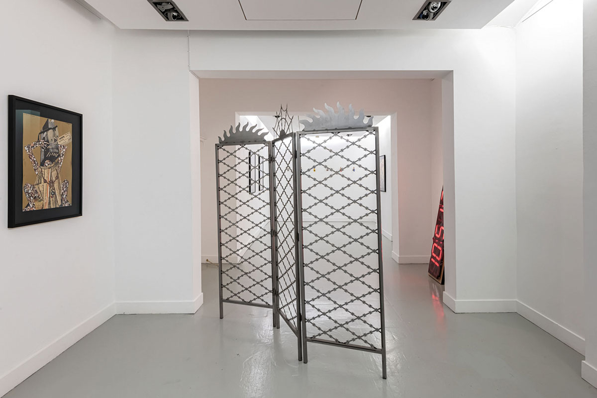
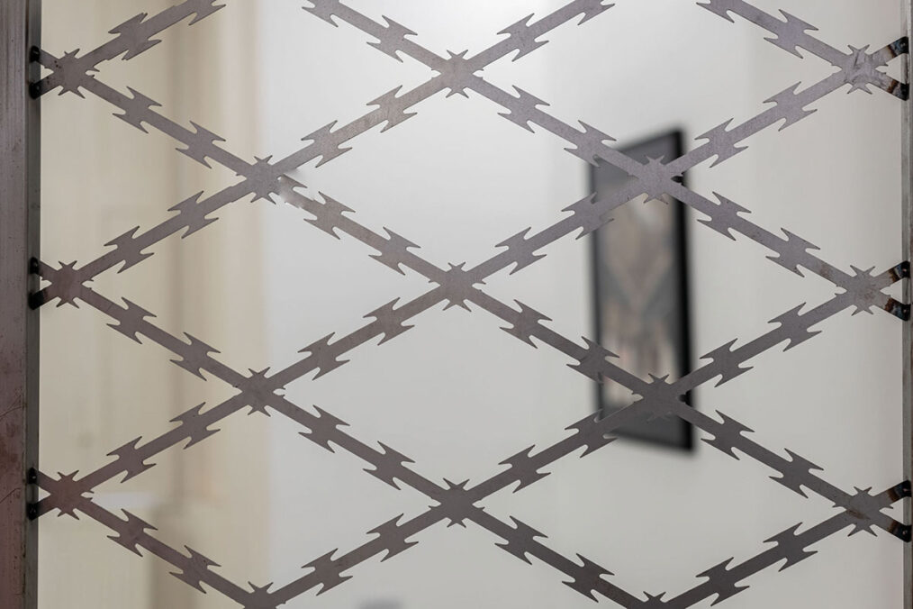
Gray Wielebinski: I think pretty much all of my work in the show is new, except for ‘Privacy Screen’ (2022). That is a work and a series of works I make that play with this idea of how one moves in the space. The work blocks the physical space of how you can move, and visually it does too, at the same time, kind of inverting the original function. It renders the violent architecture of barbed wire or hostile architecture somewhat moot because it both aestheticizes it and it becomes kind of impotent.
This is what I like in your work because it always has this aesthetically pleasing part. Next to it, there are layers and layers of meaning and research on them. On how it functions in a sense of color or in a sense of form, I feel there is always this sense of pop culture in it. Can you also elaborate on the works that are like wall pieces and flagpole holders with the number keychains?
Gray Wielebinski: This work is coming from what was in earlier stages of putting kinds of materials together that I’ve been thinking about. I still have the pictures of it in my home office studio and can see them here.
They are flag holders without the poles, which, you know, in and of itself is a statement. They’re kind of beautiful, weird objects that, again, are rendered useless or, you know, literally impotent by not having flags in them. They also look very phallic; they look very sexual and kind of sexy and also kind of bizarre. I am always curious about these kinds of objects. And so I appreciate what you said about my work. I think it’s important for me to have an initial reading or reaction, wherein you don’t necessarily have to have all of the information. For me, the conceptual underpinning is very important to put the work together and to make meaning for myself, but it’s building up so that it can get to a place where one can also just experience it, and then it maybe has other layers emerge as you find out more context, or if you read the materials list and see what it is. But I’m interested in power and identity, and I think especially when thinking about war specifically or violence at large, especially throughout the 20th century, during which nation-states and nationality became dominant ideological structures and one of the main factors underpinning identity formation and conflict and violence. The one way to enter this is through the hyper-individual perspective.
Traeger was also a war painter, which is very interesting as a job, but also what that kind of means in general, that we still have and look to art in times of violence and war, and conflict. The hyper-individual versus the dehumanization that’s involved. And so I also think a lot about our relationship to animals as one approach to considering these themes. The work upstairs with the bleeding cow is from a series of found images of cattle wrangling, which is a form of both performative and very real violence, depending on perspective. The paddles only show the after effects of the event and focus on the steer staring directly at you.
I’m interested in the cattle tags you use in your work. They’re such a powerful element; can you talk about what draws you to them?
Gray Wielebinski: The cattle tags are, quite literally, dehumanizing, meant for animals, not people. But that’s also why I use them. I’m interested in numbering in general, both aesthetically and conceptually. Numbers have so many cultural references; sports, for instance, is something I play with in my work. A jersey number can signify individuality, but it can also strip identity away. There’s a violence in being reduced to just a number, but paradoxically, it can also be a marker of uniqueness.


This duality is strong; on one hand, it’s about victims being forgotten or anonymized, but on the other hand, there’s also something strangely familiar, almost mundane. Like the tags could belong to lockers in a swimming pool or keys in a sauna. Can you share some impressions now that some time has passed: how people have responded to the exhibition?
Kollektiv Collective: The feedback has been great. Verena was here during the install, and for the opening, she brought her whole family: her daughter, grandchildren… we had four generations present in the space. That was incredibly special because the entire exhibition revolves around intergenerational dialogue and temporal conversations. To have that literal embodiment of time in the room—elders and children sitting together, the kids just lying on the carpets during the opening speeches. It was very moving.
Exhibition: Of course I know eternity curated by: Kollektiv Collective
Artist: Gray Wielebinski and Wilhelm Traeger
Exhibition duration: 8 May 2025—18 Jul 2025
Venue: Austrian Cultural Forum London, 28 Rutland Gate, London, SW7 1PQ, United Kingdom
Opening times: Monday–Friday, 9 am–5 pm. Closed on bank holidays and Austrian public holidays.
Next event at the Austrian Cultural Forum London: Interventions in Space and Memory: Traeger, Wielebinski, and Zhilyaev in Curatorial Dialogue, a panel discussion between curators Denis Maksimov, Sasha Shevchenko, and Pia Zeitzen (Monday, 14 July, 7 pm)
Austrian Cultural Forum London – www.acflondon.org
Gray Wielebinski (b. 1991, Dallas, TX, USA) lives and works in London. In Wielebinski’s expansive practice, incorporating installation, video, drawing, performance, collage, sculpture, and more, he explores intersecting themes of power, nationhood, desire, and memory. www.graywielebinski.com, www.instagram.com/gray_wielebinski
Kollektiv Collective is a London-based curatorial collective founded by independent curators and writers Pia Zeitzen and Sasha Shevchenko in 2019. Kollektiv Collective specializes in site-specific curatorial projects with a research- and process-led collaborative practice. Zeitzen and Shevchenko’s work is rooted in their fascination with space—architecturally, conceptually, and socio-politically—through which they engage with contemporary anxieties in order to critically and communally contextualize different modes of being in the present. Working site-specifically, the underpinnings of their projects are developed with and against a given exhibition space and setting. www.kollektivcollective.info, www.instagram.com/kollektiv_collective
Wilhelm Traeger (1907-1980) was an Austrian painter and graphic artist of the New Objectivity movement. From 1970 to 1974, he was president of the Upper Austrian Art Association. Wilhelm Traeger estate: www.wilhelmtraeger.com