A basic start: All works are painted on printed material. What was originally shown?
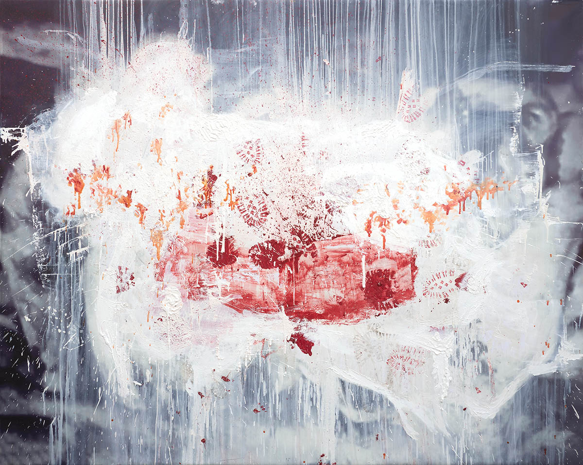
With this series, I used the images of massacres. I abstracted them by overexposing them in the middle and then painted on the top.
And you found them where – in the internet?
It’s different archives. There are some images from Holocaust, some from Vietnam war. But I really didn’t want them to be identifiable. I wasn’t trying to give a historical record (it was about something else).
And why did you choose this topic at all?
I mean, you could have also chosen flower? When Bob Dylan was asked why did he write his first song – and he only wrote it for his second album –, he said, he never wanted to be a writer, he never had a kind of ambition. But at that time, he said, the world didn’t seem right to him without that thing being pronounced or sung.
So why did I choose this specific topic? Because I felt that something was unpronounced and needed to be addressed. It’s a part of the subject matter, I guess.
There was also something about a horror that you face when you go to a Holocaust museum or similar. Usually when you leave, you leave with a feeling of it as something that has happened and will probably, hopefully not happen to you. But it is something that’s happening out there. But when you are actually looking at the images [of the war scenes, e.n.], there is this moment of recognition when you feel like it is happening to you right now. The first look you have of somebody dead or being beaten up or other terrible things happening. Just for a second you feel it is you, and then it becomes a kind of logical thing having to cope with it. I wanted to capture this first moment. You feel like it is you laying there, being dead. And for that, I needed to make the images less recognizable. Open up the images that you could feel it is happening to you. Essentially, it has to do with empathy.
That’s interesting, because you talk about abstraction. For me, the paintings are violent, but not only; there’s always love inside. A form of a flower or something positive. And seen where they actually come from, this is quite remarkable.
Yes, absolutely. I was recently reading Hemingway on how he writes. And he would say: “I would never get stuck or not know what to write about. Because I knew I just need to say one true sentence, or come up with one true thing. And then the rest would follow.” With my paintings it is something quite similar. I choose something which I believe to be true. And I don’t know whether at the end it will resolve, or whether I will be able to recognize this thing in the painting. But it helps me. I’m not trying to tell a story or teach anybody how to look – maybe I’m trying to do that. But it’s essentially about choosing something you believe to be true. And then trying to make every step, every brush stroke or movement you make on the painting ring true. And I don’t know what true is.
You have to feel it.
Exactly. I was next to death a couple of times. And you’re trying to remember how did it feel, looking at you dead sister, or a dead body. There’s a lot of love, desperation and emptiness going on. Basically, I am trying to recollect those moments, how the air smelled; and then trying to paint that.
That quite directly relates to the title of the show, “You’re Gonna Die.” Is it meant in a sarcastic, neutral, challenging, aggressive way?
Well, how did it feel to you? Before, and after seeing the show.
When I first heard it, I definitely heard it as a provocation: “You’re gonna die!” But then, in the first room it becomes a startling tone; and then it transforms into relief, and pity. Rather a simple statement: You’re gonna die. But death is present in all the rooms.
You got it completely right. And I like that the rooms are so different. Coming back to the question, I think it is a funny statement. There was this comedian, Norm MacDonald. And his punchline would be “You’re gonna die!” And I found that quite funny. He would just say these very obvious statements as if they were news. Under a title, you usually have a quote or something. And I came up with this quote: “You’re gonna die. – Unless these paintings convince you otherwise.” And I thought, that’s pretty good: You start the exhibition with a kind of mutual agreement on something very obvious, that we’re gonna die. And if the paintings do their job, they communicate something. [After university, it feels that people come to exhibitions, and see art and they think about nothing else but other art that was made. Or they start talking about politics mostly. And to me, it is the forgetfulness that you are going to die.] So “You’re Gonna Die” is a common ground that makes us all one race. And it is pretty nice when people come and look at art from this perspective. Get away from intellectualizing too much.
That relates to another aspect: I think your paintings are a lot about emotion and feeling. In the exhibition, there’s mostly black and white, a lot of red and some yellow. Did you have specific thought on the colours, do they mean anything in particular?
Colour always relates to me to things in the world. When De Kooning was asked a similar question, he would say about some green part in an upper corner: “I just tried to remember what was it like to be on a supermarket parking lot. And I remembered a specific type of green that the grass was and I tried to put that in the painting.” So, same thing here.
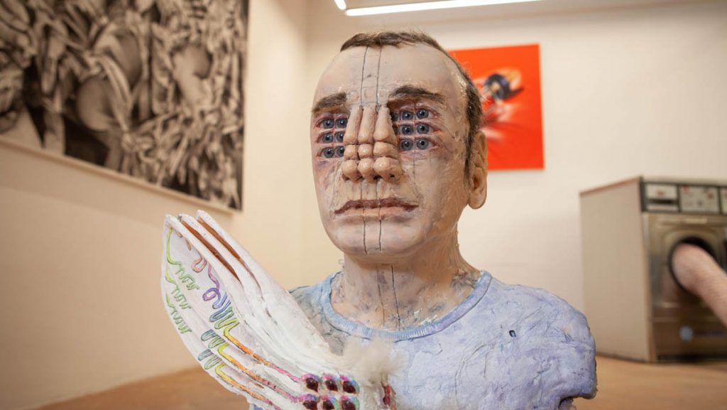
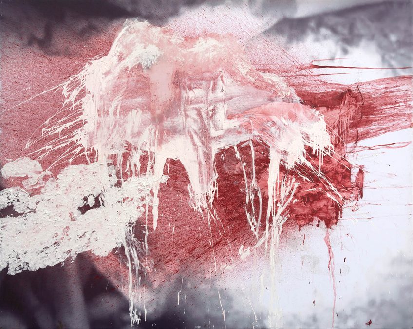
Obviously, red has an instant recognition about it: Of blood, flowers, fire. There is a small sculpture in the exhibition, and it was very important from me to include it. To me it was something to bring the viewer back to think of red not just as a colour in an abstract painting, but as blood as your nose is bleeding.
The paintings weren’t supposed to have colour in it. There was supposed to be just two colours, black and white and then white on top of it. And Julian Schnabel gave me the very important advice to put colour into it. Then, I was reading Isaiha, trying to find a colour – as a good Christina person I open the bible when I need to choose a colour [laughs] –. And there was this passage which said: “Your sins are red as scarlet but I will make them white as snow.” And I love that something red, something bad, a wound, is turned into something white. And I chose this to be the engine for the paintings. With yellow, I was thinking of the light. Sometimes you have this very yellow light falling on leaves, or shining through. Colour to me is not a formalistic thing. I am trying to figure out how things look, what colour things have, what relation and associations we, and I have with specific colours; what kind of history. And try to use that.
You mentioned the Bible: In the last room, there are two paintings. One is called “St. Marie”, one “Yah Yah”. With the last, I immediately had to think of Jesus.
It could be Jesus. With those paintings I took images of unknown people. These are mug shots. It’s a very specific genre of photography, usually when you see a mug shot you think “Oh, it’s a bad person, the person did something.” So here, you take a mug shot and make saints out of them. To me, that’s exactly how the world looks. That things aren’t interchangeable. If we saw saints in each other we would live in a much better world. I mean, you woke up today, that’s pretty tough.
I saw the room as a kind of Passion, there’s Jesus, his mother, an abstracted cross hanging on the wall. And the abstract work reminded me of a Baby-figure.
It’s amazing that you saw it that way! I grew up with stories so they are probably somewhere within me. St. Mary reminded me of one of my favourite paintings, Piero della Francesca’s Jesus with his blood sweat. And of course, when making the blood-paintings, I thought about Caravaggio’s “Doubting Thomas”, when Jesus puts Thomas’ fingers in his wound.
In many of the paintings, there are footprints of yours on the surface. In case of “St. Marie” and “Yah Yah”, it feels like these people are stepped on. Are they?
When I make paintings, I always think that the subject matter is the way you make stuff. So, if you want to paint Jesus, it is not the face of Jesus that is going to matter. You can make a portrait of Jesus and not even have his face in it. It is more about how you make stuff. So, when I chose these images I knew, it needed to feel you find a saint under your feet.
Coming back to the Baby-figure, which I also saw in another painting: What’s your comment on that?
Absolutely. Personally, I don’t know what it is. I knew that there was a form. I always loved the little cloth that babies are wrapped in, it almost looks like a dumpling. In so many especially early Renaissance paintings, you would have this gold backdrop for air, and then you have these very strict faces in Giotto. And then the clothes would be the thing to make the picture. A white dress or a blue mantle, that is what describes Mary. To me, there’s no difference between abstract and figurative painting. I absolutely believe that. There are paintings that are more instantly recognizable, and there are paintings that are less easily recognizable. But it’s all just paint on canvas. And things are interchangeable.
Taking paint and canvas as buzzwords, would you briefly like to comment on your material? I know you mostly work outside, so is the outdoors-suitability of specific importance or conceptual value to you?
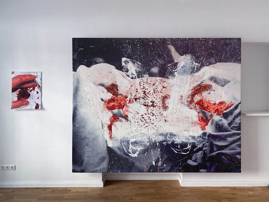
It’s absolutely not. I print on vinyl and then paint over it. In the case of “St. Marie” and “Yah Yah”, I used a solvent that dissolves the ink to arrive at a more “unfinished” image. Photographs usually have a quality that you as a painter should avoid, a kind of flatness or even bluntness. And I see this in a lot of paintings that I don’t like. When I saw Vermeer for the first time, I was just amazed because it feels like you’re not looking at the figure, but at the air between you and the figure. Basically, dissolving the print created a similar effect, a ghost-like presence between you and the face you are looking at. Everything I say about the paintings is just something that I found out for myself after I made the paintings.
My associations of the paintings in the first room where “confrontation”, “absence”, and “void”. In his Pandemoniac Manifestos from 1963, Georg Baselitz wrote “Negation is a gesture of genius, not a wellspring of responsibility.” What place does negation hold in your work and process?
Negation understood as: It is more important what you don’t say than what you say? Yes, absolutely. I live and work by that. I was re- watching the movie “The Prestige”, and I thought that is pretty much what it is like to be an artist: The movie is about two magicians who compete with each other, and It puts you in a landscape of how it is to be to be a magician. There’s audience and while you’re distracting them you actually do the trick. If you walked into a show called “You’re gonna die” and it would simply feature paintings with dead bodies, that was it, the experience was gone. Damien Hirst probably could work it out well. But it is about pulling a good trick, giving an impression. I’m more interested in what I have not seen. For example, taking Christ: we’ve all never attended a crucifixion; Caravaggio never saw Jesus. But he made pictures that make you feel more present than if you were there. It is more real than the real. So yes, negation is definitely part of it.
It is like in mathematics: minus + minus is plus. Coming back to Baselitz, for many of your works, he is a set reference. In German, there is the expression, “sich abarbeiten an”, which translates somewhere between working through and processing. Do you “abarbeiten” yourself through Georg Baselitz? What do you expect to find?
I think I’m robbing him. In the best sense of Art History possible. Could you say that Caravaggio robbed Titian? Surely you could. But Caravaggio made Caravaggios. It is something that I find very useful to me. But a more permanent place than Baselitz for me is Julian Schnabel. If there was no Schnabel, there would be no Spivakov. He created a whole visual language that nobody really acknowledges or talks about, especially artists. He once said: People think I have everything, so they don’t give me awards. In this sense, I am learning the visual language of Julian Schnabel, partly of Baselitz. But Baselitz is more interesting to me as a German character.
I would neither say your robbing from nor learning the visual language of anybody, but creating your own. Francis Bacon said that every painter within his work processes Art History anew. I rather think of this conception.
In order to create new, you need to rob. Who said it again, “Mediocrity borrows things, and genius steals it”? [Igor Stravinsky, e.n.] Robbing in the best way possible. Art history moves because of robbing; robbing is the best compliment you can ever get. As an artist, I don’t have any pride; I only have the desire to make good work.
Some of your paintings have unusually long titles. It seems that in some works you relate to very specific situations. Do I see that correctly?
Concerning the long titles, I just like sentences. When you look at my paintings, I don’t want anybody to see a one-percent thing. A lot of my paintings have a very situational element about them. I wouldn’t say it is a very specific personal situation, but something the painting refers to. The titles should help you feel that situation clearer. It’s more like poetry, I’m looking for titles that help see the painting better.
That’s great! Thinking of your works in this relation just now opens them up a lot. With the titles, I would say there is a kind of projection happening. In the sense that a more general idea is projected onto a painting. Do you agree?
Absolutely.
At what point, then, does the projection come up? Is it something intentional, or does it rather happen somewhere during the process?
Sometimes I know specifically the name of the situation I want to paint, so I would name the painting before I start. Sometimes I don’t even know the situation painted, and I would just look for sentences or words to describe it. [It is very good to talk about it. Because as a painter, you don’t get a thing. The job is to make paintings, not to come up with concepts. But once you sit back and it is very nice to reflect on how it all turned out.]
Jonathan Meese, a German artist, said to me: You can’t theorize art while making it. So I guess this refers to what you just described.
Exactly.
In earlier works, you painted on prints by works of Georg Baselitz, among others. We have the concept of Appropriation Art. But relating to what you just said, you are not necessarily or only appropriating art; but rather projecting something to it. How does that concept sound to you, Projection Art? In the sense, that the appropriated work becomes secondary to the ideal projection; and the original image or work is thereby being continued.
You phrase that very well. It is definitely about taking an image as a given; even my own interest in Baselitz. But the work is not me taking one thing or another; the work is what actually ends up on the canvas.
We mentioned Baselitz several times, but when I look at your paintings there’s also Cy Twombly, Philip Guston, Robert Rauschenberg; or now Doug Aitken and Wolfgang Tillmans.
I’m interested in Baselitz as much as I am interested in smudges of dirt; I’m interested in Caravaggio as much as I am interested in a particular green outside of my studio. We can go on. It is just things you take. You can be interested in the best painters in the world, but that doesn’t make you a good painter. What makes you a good painter is the paintings that you make. I do take my interests seriously for myself; but I don’t think they are decisive factors in whether a painting is good or not.
I just thought: It is about the visuality, and not the persons.
Absolutely. To me Baselitz doesn’t exist apart from his paintings. He is still alive, but if we ever meet I will meet a different Baselitz. The real Baselitz are the paintings that he made. The real Spivakov are the paintings that you see. And if they are shitty, well, that’s too bad.
Your “Sky”-series features reproductions of skies; marks in paint. And mounted condoms. This collage-elemet is not present in other works. Would you like to comment on these works?
To me, everything is a collage. When you put some paint on canvas, it’s a collage. With some materials you’re more in control than with others. But there’s no hierarchical difference between a painting and a collage. With the condoms, it was just the material that was next to me at the time. So, I used it.
Finishing with another citation from the Pandemoniac Manifestos: “I’m the vanguard of my journey.” Where does your journey take you next?
Hopefully there’s gonna be a show at Salon RT Gallery in London. Apart from that, I’m open for propositions. But I never like thinking about that stuff. What’s happening to me next, is the next painting. And I’ve been living after that for the past six years. And so far, it is the only way I can exist.
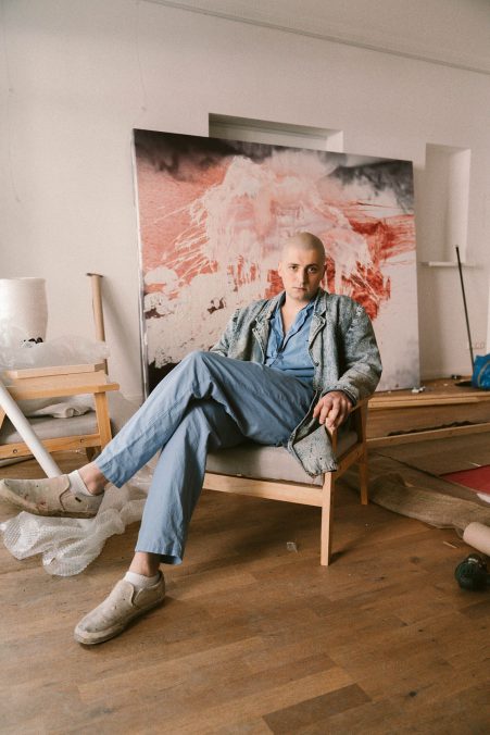
Daniel Spivakov (*1996) is a Ukrainian artist whose practice focusses on painting and visual examination. The concept of empathy is of essential concern for his artistic approach. Daniel studied Painting at Central Saint Martin’s College, London. Exhibitions so far included: Baselitz, Richter. Berlin, Stallmann, Berlin (2020); PAINTINGS – DANIEL SPIVAKOV, Schlombs + Stallmann, Cologne (2019); Bible lies in the drawer of a Hilton hotel room, Stallmann. London (2018); Coexistance, an installation by Daniel Spivakov, The Moonlighting Social Club, London (2018).
Daniel Spivakov – www.instagram.com/daniel.spivakov
Address and Contact:
STALLMANN
Schillerstraße 70, 10627 Berlin, Deutschland
www.stallmann.club – www.instagram.com/stallmann.galleries/