Hsiaosung Kok, you are a collection curator at Museum Ritter. What is your area of responsibility in the Museum?
I take care of and maintain the Marli Hoppe-Ritter Collection. I also develop, curate, and realize exhibitions at Museum Ritter. Our exhibition program is closely connected to Marli Hoppe-Ritter’s private collection, which is committed to constructive-concrete art. In the museum, we display the collection in temporary themed exhibitions, complemented by solo shows featuring artists from the collection.
How did the Marli Hoppe-Ritter Collection come about? What’s the focus behind it, and is the collection still growing?
Marli Hoppe-Ritter is co-owner and shareholder of Alfred Ritter GmbH & Co. KG — the chocolate manufacturer known for the Ritter Sport brand. She has been collecting geometric art since the early 1990s. She’d always had an interest in art, even from a young age; collecting grew out of that personal passion. Her focus on this particular direction, geometric abstract art, is tied to specific experiences. One important one was an exhibition at the Wilhelm-Hack-Museum in Ludwigshafen, which holds a significant collection of geometric abstract art. In 1986, the museum held an exhibition titled „Von zwei Quadraten“. Wilhelm Hack zum Gedächtnis („Of Two Squares. In Memory of Wilhelm Hack“), which took as its starting point a work by the Russian Constructivist El Lissitzky from the 1920s. The exhibition brought together historical avant-garde works, but above all, contemporary art influenced by them. For Marli Hoppe-Ritter, it was a turning point.
Kazimir Malevich’s famous Black Square, 1915, is considered the most radical icon of non- objective art. Malevich’s practice at the time gave rise to Suprematism and later influenced Constructivism. Mrs. Hoppe-Ritter owns a small work by this towering figure of geometric abstraction, a small drawing related to the Black Square theme he exhibited in 1915.
The second major body of work associated with the square is Josef Albers’s Homage to the Square series. Albers taught at the Bauhaus and later in the USA, where, from 1950 until he died in 1976, he worked on this series and created over 2,000 oil paintings. Despite the title, Homage to the Square is more of a homage to color. It investigates the interaction of colors and the perception of color; therefore, the exploration could, in principle, go on infinitely. These reference points, works by Josef Albers, El Lissitzky, and Kazimir Malevich, are indeed the starting point for our museum’s whole programmatic focus, growing out of the square as a form in its formal simplicity and its relationship to color.
Several other exhibitions were also important to her. In 1989/1990, the Kunsthaus Wiesbaden held an exhibition titled 10 x 10 x 10 cm, co-sponsored by Ritter Sport, built around a small fixed format in which artists submitted designs—the exhibition ultimately brought together around 1,000 works.
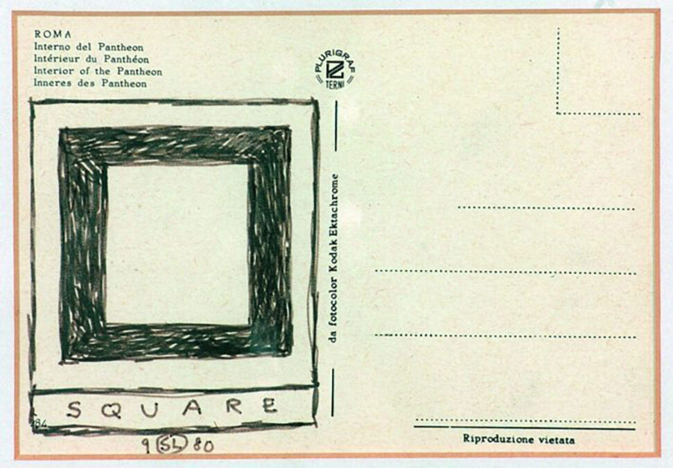
Then, in 1993, Mrs. Hoppe-Ritter acquired her first artwork, which remains in the collection to this day. It’s a piece by the conceptual artist Sol LeWitt from 1980: a postcard from Rome showing the Pantheon and its famous coffered ceiling, inscribed by the artist himself with a drawing on the message side. Titled Square, it shows a small black square painted onto the back of the postcard, not a simple square, but rather what you might call a receding, spatial one.
That’s how it all began, in 1993. Mrs. Hoppe-Ritter has continued collecting ever since, and the collection now comprises over 1,200 artworks dating from the 1910s to the present day. The museum’s holdings encompass painting, drawing, object art, installation, light art, and kinetic art.
That’s fascinating. Recently, postcards as an art medium seem to have made a comeback. How was the museum itself founded, and when was it built? The architecture of the museum building plays with the same geometric forms and light that define the collection.
The museum building opened in September 2005. The Museum Ritter, designed by Swiss architect Max Dudler, is located in Waldenbuch, about 30 kilometers south of Stuttgart in Germany, right next to the Ritter Sport chocolate factory. The building consists of two wings. On one side is the art museum, with its exhibition halls and museum cafe; on the other side is Ritter Sport’s „Bunte Schokowelt“ (Colorful Chocolate World), which includes the factory outlet shop, the chocolate exhibition, and spaces where visitors can attend workshops.
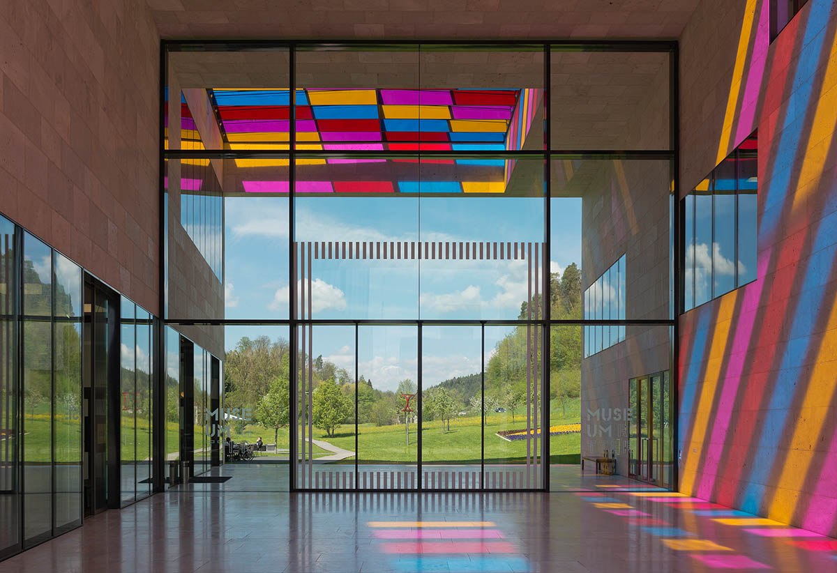
Structurally, the building is a cuboid on a square floor plan. What’s interesting is the warm-toned shell limestone, which blends into the landscape of the Schönbuch Nature Reserve. At the center of the building, there’s a passage; when you stand there, you get a beautiful view of the landscape. Inside the museum, in the exhibition spaces, the square floor plan is only very subtly discernible—in the overall layout of the building and in the grid pattern of the light ceiling in the exhibition spaces.

When the sun shines on the museum building, its light comes through the skylight and makes colorful shapes on the passage’s floor and walls. It is an art installation by the French artist Daniel Buren; he created it as a site-specific work for a solo exhibition here at the museum. Afterward, the collector acquired the installation; it’s now permanently part of the museum and inseparably linked to the building. On a sunny day, the light is projected into the passage with real intensity and clarity; visitors play with it and photograph themselves in different color tones. Projected Colours by Daniel Buren is a successful fusion of the museum’s constructive-concrete program and the colorful world of the Ritter Sport brand.
How many exhibitions are currently on view?
Through September 27, two exhibitions are on view. Heavy Metal: Works from the Marli Hoppe-Ritter Collection explores the significance and diverse expressive possibilities of metal as a material through works from the Marli Hoppe-Ritter Collection. Alongside, we are showing the solo exhibition Zwischenräume, featuring works by Zurich-based artist Marguerite Hersberger.
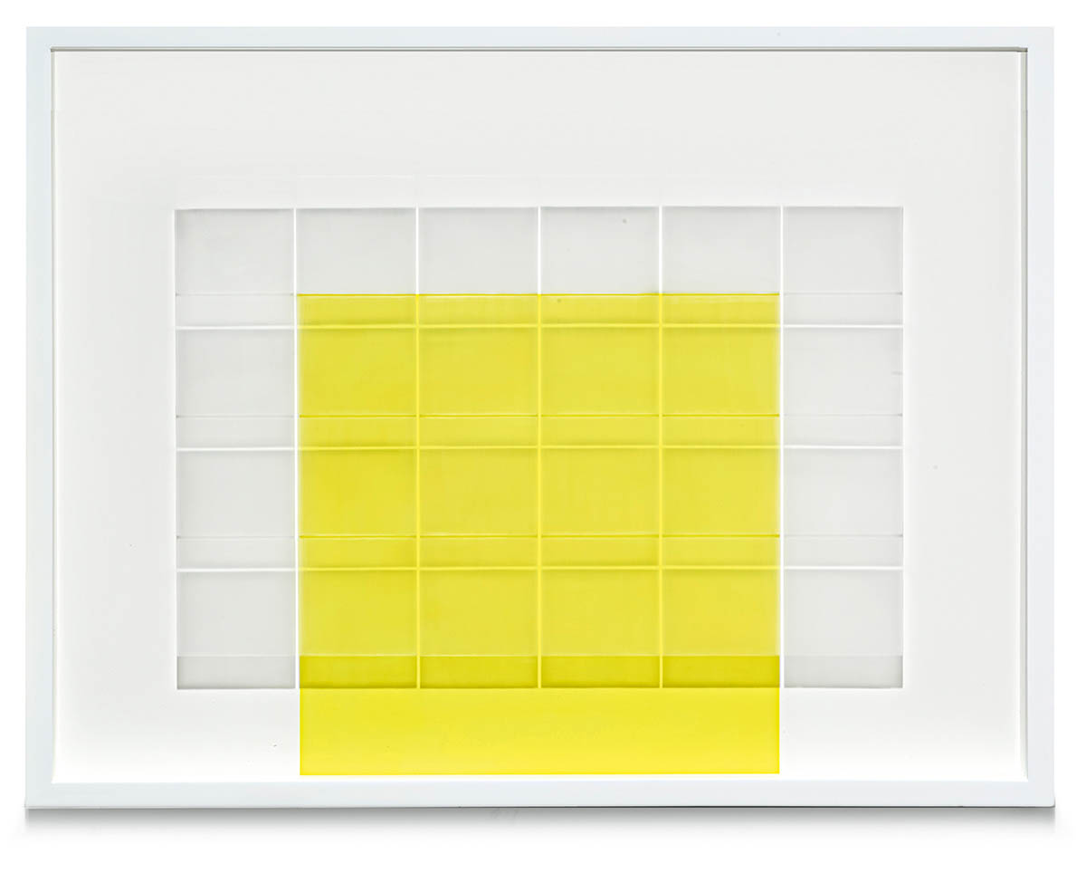
Now, there is the solo exhibition Zwischenräume (Interspaces) by Marguerite Hersberger, an artist from Zurich. Most of the works shown in the exhibition came directly from her studio. It’s a beautiful exhibition. Hersberger belongs to a generation of artists who are now in their eighties. Historically speaking, this generation of women artists received relatively little recognition. Things are much better today. Female artists are receiving more and more attention and recognition for their achievements.
As part of the group exhibition Heavy Metal, I’d like to begin with Heinz Mack’s Ohne Titel (Lichtrelief), 1958, the earliest work in the exhibition. Please tell us a little about the piece and what makes it so special.
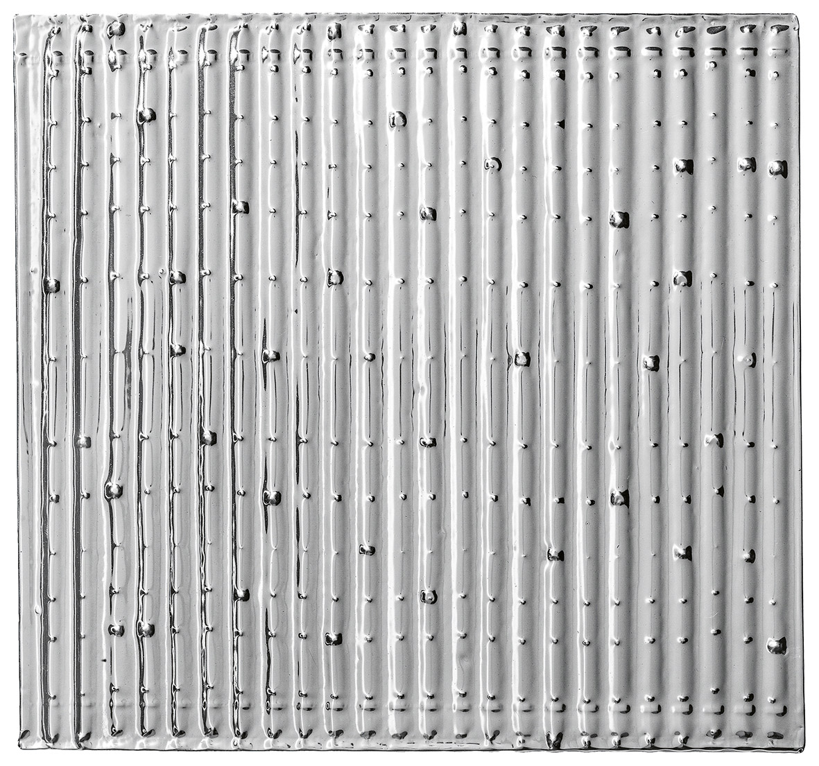
It’s a relatively small work, measuring approximately 33 by 33 centimeters. It’s made of aluminum foil mounted on a fairly thick, substantial hardboard panel, with the foil applied directly onto the surface. The work dates from 1958, so it’s not only the earliest work in our exhibition but also an early work in Heinz Mack’s oeuvre. Mack co-founded the ZERO group in 1957, just a year before this work was made. That’s when the famous evening exhibitions in Düsseldorf began, initially with Mack and Otto Piene, who invited like-minded artists to take part. Günther Uecker joined the ZERO group a few years later, in 1961.
That brings us to the ZERO group itself: this postwar new beginning built around industrial materials, with light and movement as central elements. How are those particular relationships to materials reflected in the exhibition?
Back to Heinz Mack to illustrate this, because I think it’s quite telling about what was happening in that circle at the time and what came later. You have to picture it: he takes a sheet of aluminum foil, and what does he do? He lays it over a texture plate with some kind of relief structure and presses the foil onto it, essentially embossing the relief pattern through the foil; the structure comes through and appears as a relief on the foil itself. Mack employed an „un-artistic“ material that wasn’t used in art before; it wasn’t common at all until a few years prior.
What Heinz Mack achieved with it was to make structure visible rather than to compose. Composing on a flat surface was no longer what interested the ZERO artists. Instead, they were interested in structure, light, and vibration.
The foil isn’t a vehicle for depicting some subject. Here, the material itself is the content of the art. And above all, light is. It’s about the reality of light. What it reflects: that becomes the focus of the work.
In Mack’s case, this takes the form of dynamism, vibration, and a relationship to the viewer. It’s important how the viewer is standing next to it. Aluminum was, and still is, a wonderfully rewarding material to work with. First, because it’s extremely lightweight, it has a very sleek, slender visual quality. It allows for fine, detailed structures. It’s different from steel; a degree lighter and sleeker still, it has the highest reflectivity of all metals, which is why it’s used to manufacture mirror glass—that’s essentially what aluminum is when vapor-deposited: a mirror. It’s no surprise that several artists in that period, artists pushing for an entirely new kind of art, worked with aluminum or with mirror glass.
How does its influence still resonate today?
ZERO was a major international movement. These artists networked across cities: Paris, Düsseldorf, Munich, Milan, and Padua. There were many centers. There were quite a few shared ideas that emerged as they got to know each other and connected, above all, a shared desire for a new beginning in art. ZERO is particularly an attempt to unite art across nature and technology in harmony. Nature comes in, for instance, through light: through engagement with real, physical light. The spirit of experimentation was forceful at the time, and it remains unchanged to this day. An important characteristic we’ve inherited from that era is this engagement with all kinds of materials.
There were different visions as well. For example, French artist Bernard Aubertin used different techniques to make his metal artwork Tableau-feu in 1965. With metal, particularly if it is steel, you have many more possibilities. The real difference, compared to what had existed for centuries, millennia even, before that in works made of metal, is essentially bronze sculpture. Bronze casting dominated art for millennia, particularly figurative bronze sculpture.
Then, around 1930, steel comes onto the scene. Steel got integrated into art as an artistic material, and with steel, you could and can do entirely new things: you can weld it and roll it into sheets. You can cut steel, forge it, polish it, bend it, and fold it. Using steel as an art material brought new technical possibilities and gave artists more freedom to create.
For example, Bernard Aubertin takes a metal plate, perforates it, and then engraves it, scoring it to create a kind of grid, and then he holds the whole plate over a fire. He uses the burn itself as a brush because there are these thread-like marks, scorch trails, and burn traces, which are still visible on the plate today. At the same time, the fire acts almost like a curving knife because the heat causes the metal sheet to warp and distort. It’s a controlled burning process. That same spirit of experimentation is evident in many of the works in the exhibition.
We begin the exhibition in 1958 with this relief by Heinz Mack. But when did the use of steel, aluminum, and new techniques in art really begin, and how did these developments evolve after the Second World War?
We start in 1958 with this relief by Heinz Mack. But the real innovation happened earlier, around 1930, when steel entered the art world. Later, after 1945, aluminum also became widely used in art. And these new alloys came hand in hand with new processing methods. What happened after the Second World War was more a matter of picking that back up and developing it further, rather than some new technical leap happening after 1945. Artists increasingly explored the formal and technical potential of steel and aluminum. Much of what we see in our exhibition has roots that trace back to before the Second World War.
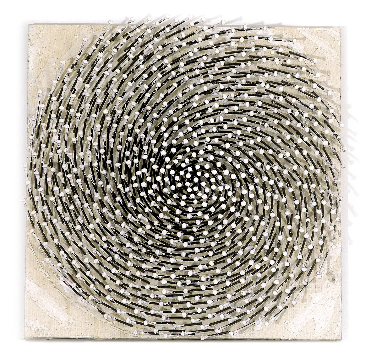
This includes not only new materials but also the whole idea of using ready-made, prefabricated objects in art at all: readymades. Marcel Duchamp’s bottle rack, for instance, is made of metal. He wasn’t a metal sculptor; he went and bought the thing in a shop. That mode of thinking that I can go into a shop, buy something, and declare it my „bouquet“ and turn it into an artwork—we see that carried forward later as well; for example, Günther Uecker used wood nails.
A lot of Artists are working with reinforced steel bars. Manuela Tirler, for example, is essentially a steel sculptor who works exclusively with rebar or wire. This openness toward all kinds of materials, everyday materials being brought into art, isn’t something that emerged after 1958. It already existed before. Think of the Surrealists, the Dadaists, the Constructivists, and so on. This was carried forward and continued.
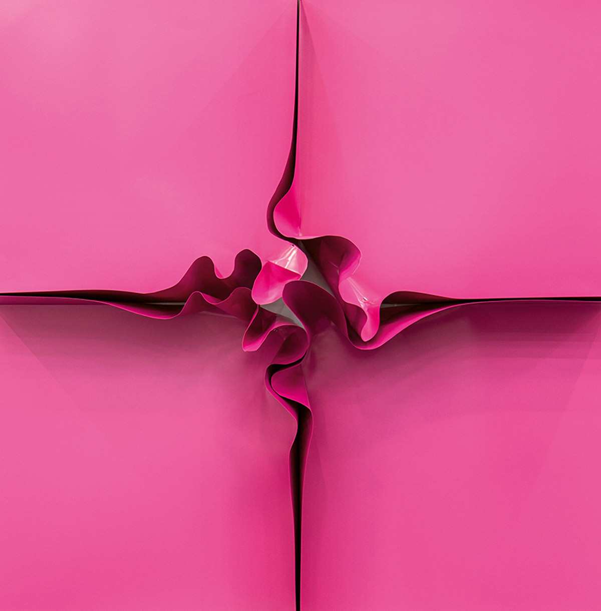
You could describe metal as „heavy,“ but you could also say it isn’t at all. How do you view this elusive genre?
Metal can be extremely heavy; we have a work in the exhibition, an iron cast [sculpture], that weighs 300 kilograms. In the exhibition, we have aluminum works, like that little Heinz Mack work, light as a feather. It depends entirely on the specific relationship to the material. We mentioned Manuela Tirler, who was born in 1977; we have modern machinery that takes over a lot of the physical work. She’s not out there struggling to operate these machines by brute force; she enjoys working with them. Kirstin Arndt, however, works a great deal with aluminum, which is feather-light.
The general perception around metal materials isn’t about actual physical heaviness; that’s more an initial assumption people make, associating metal with massiveness and weight. Heavy Metal is a catchy title; you could say the same thing about the musical genre: on one hand, that style of music can be exuberant, galloping, and loud, and on the other hand, there’s very dark and moody metal. I find the title compelling, precisely because it captures that same range.
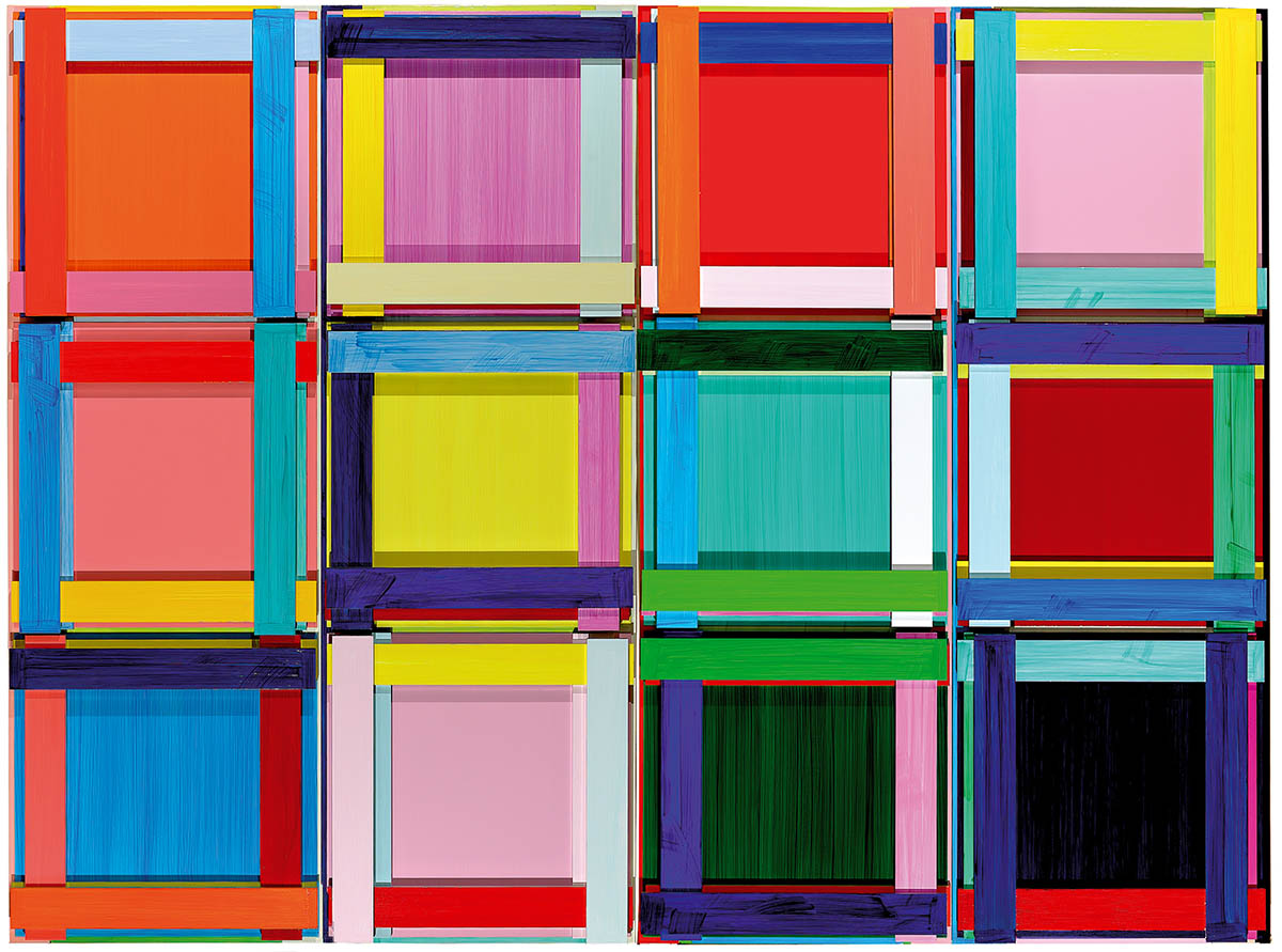
I find the title captures the diversity you were describing, the range of materials, and how differently they can be worked with.
Metal has so many aesthetic qualities, and that’s the interesting part. We have, for example, coloration, rust-brown tones. Then polished, glossy surfaces, which can range from brownish to almost “white” with mirror glass; that’s essentially light itself, practically invisible in a sense. We have a work made of copper sheet, a wonderful coppery green. Then we have a work made of brass, with a yellow tone.
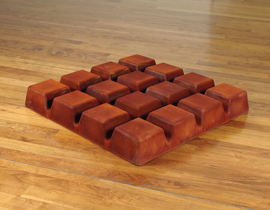
There are many processing techniques: from casting to perforating and embossing, to rolling, turning, and so on. Through bending and other processes, we achieve an enormous variety of results. On one hand, you have the massive work, like Thomas Rentmeister’s work, a one-by-one-meter iron sculpture that looks like an iron chocolate bar.
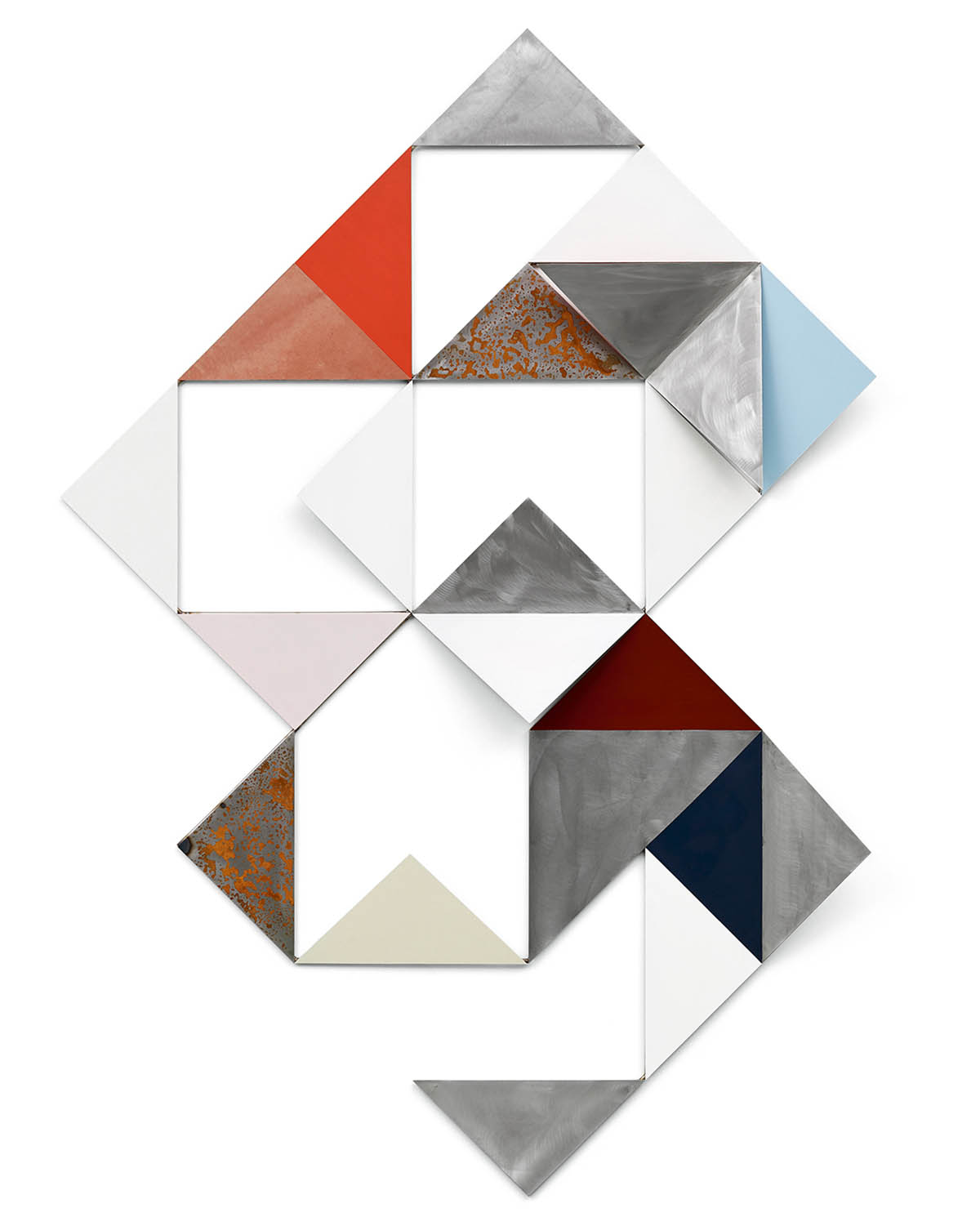
Then some artists shape their metal, aluminum, or steel sheets and then paint on top of them, because what interests them is the sculptural, three-dimensional form, not the aesthetic qualities of the metal itself (the shine, the surface, or the grayish tone of the plate). They paint over it. That’s to some extent the case, for example, with Imi Knoebel; the color sits beautifully on that hard metal surface. Gerold Miller’s work is black and white; he is interested solely in the sculptural form, and he essentially wraps the aluminum in black-and-white lacquer.
How central a role did repetition and serial structure play in these works?
The repetition and serial structure can create a sense of calm and clarity in how the work is perceived. Seriality brings the sensuality of the material itself.
Take that iron sculpture by Thomas Rentmeister I mentioned; imagine a Ritter Sport chocolate bar, 100 by 100 cm, rendered in iron with a rusted, textured surface. It’s this rust, this powdery layer, this fragile skin covering the whole surface that gives it a pull. The rust layer has a special tactile appeal. Or the copper-sheet work by Beat Zoderer, a Swiss artist, with beautiful patterns. It looks almost like a monochrome painting; he didn’t paint anything at all: it’s purely the copper sheet worked directly into the pattern.
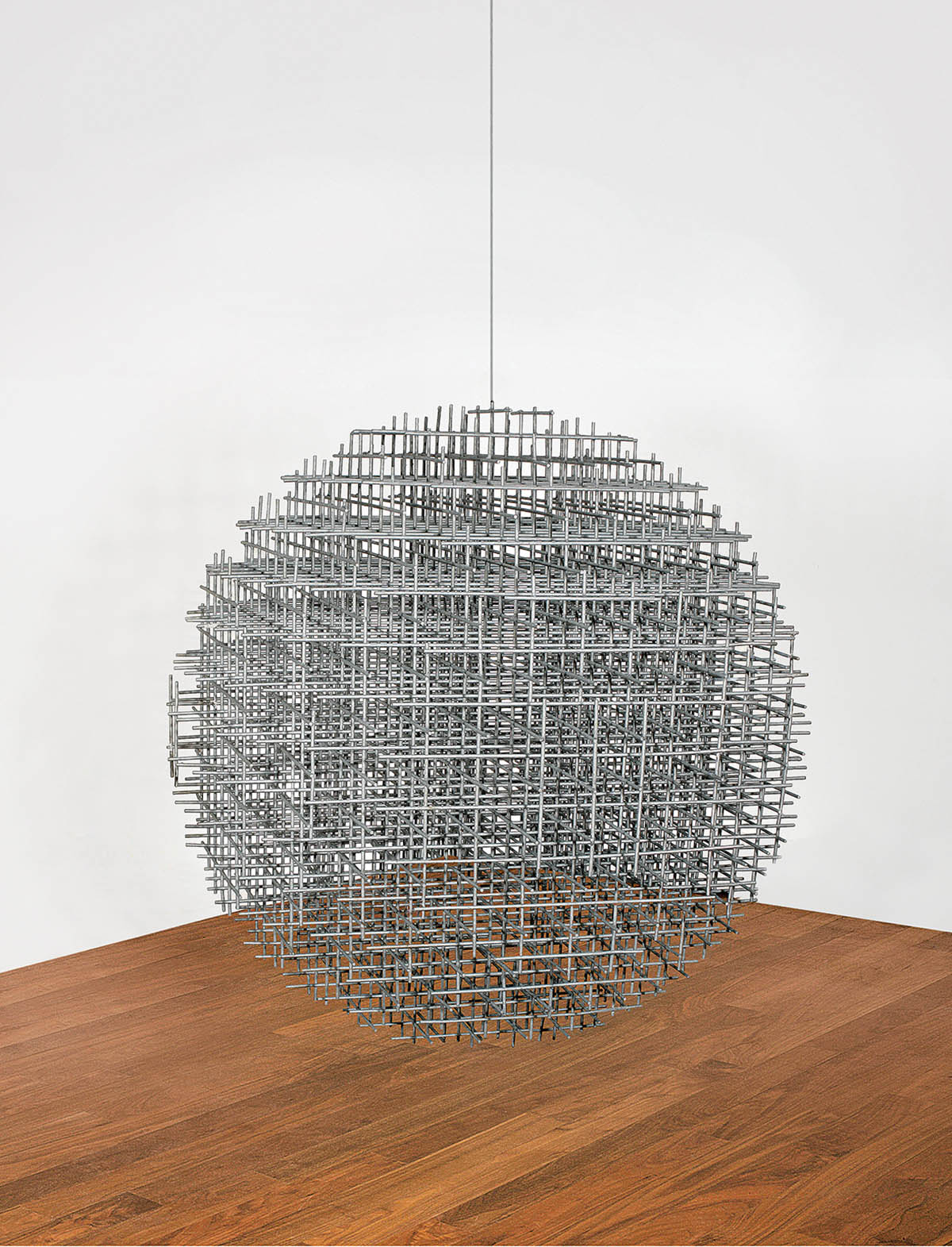
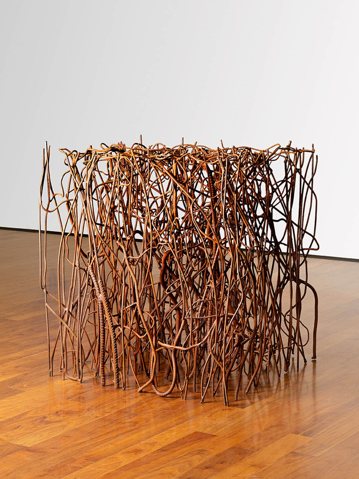
Manuela Tirler constructs her cube from numerous rusted rebars. Picture a clipped hedge in a baroque garden, trimmed into a cube shape, without any leaves. That’s what it looks like. You get order and chaos combined in a single object; she calls her process Weed Control.
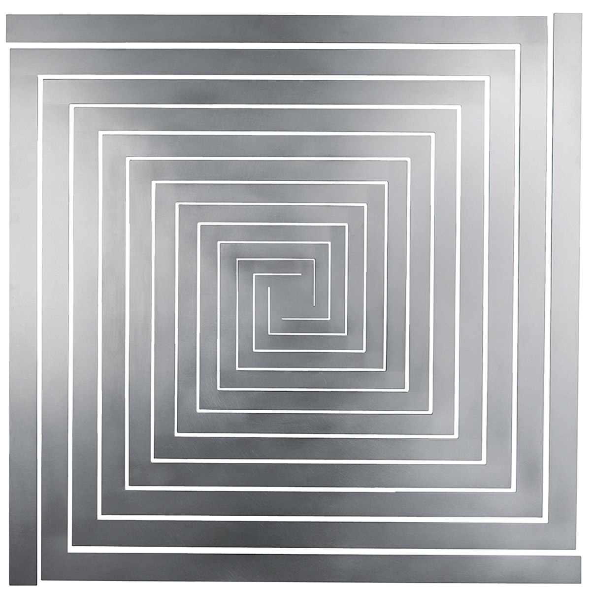
What we see with the artist from the 1960s, the ZERO movement, and their fellow artists is that they can use serial, grid-based order to create flickering, moiré-like optical effects through the overlapping grids. If you layer regular grids on top of each other and then shift the viewing angle, you get a kind of displacement and a vibration effect. That’s the case, for example, with Sphère-trames by François Morellet. Through seriality, you can definitely produce quite different effects.
What role do the viewer’s position and the lighting conditions play in experiencing these works?
When we talk about light and metal, we’re thinking of aluminum or polished steel; above all, we think of mirror glass. Mirror glass is essentially an aluminum coating applied to ordinary glass. And it’s a widespread material in art, especially in constructive concrete art.
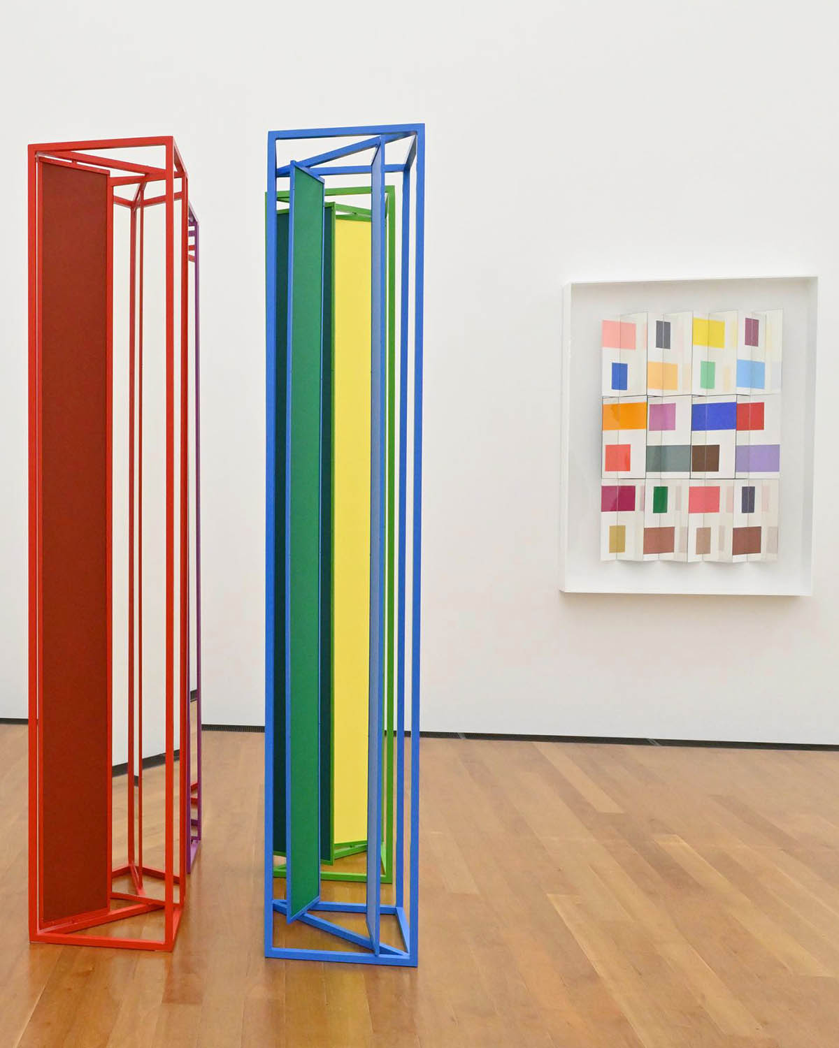
Christian Megert is an outstanding Swiss artist who has worked with mirrored glass since 1959. He is, in a sense, a representative of “ZERO Switzerland.” He works exclusively with mirrored glass. Earlier in his career, his works were more fragmented and splintered; for many years, he preferred serial arrangements. We have a beautiful work by him: it’s a multi-part work with an aluminum frame painted in purple, green, red, and blue. Set into the frame are mirror panels. Each mirror panel has mirror glass on one side, and the back is painted in different colours. And you can rotate these panels. When you walk into the room where this work stands, you’re initially disoriented. You see mirrors and various colors; it’s genuinely difficult to describe what you’re looking at. You register it as mirror glass because it reflects everything around it. But because the mirror panels are tilted, you partly see their painted backs; you often don’t see your reflection clearly. Occasionally, you only see part of the room. This confusion is an important part of his work.
These artists in the ZERO Movement carried forward the attitude and the program they developed back then. Right after the war, after all that destruction, despite everything that had happened, despite all the devastation and suffering, they were remarkably optimistic, and they translated that optimism into their art.
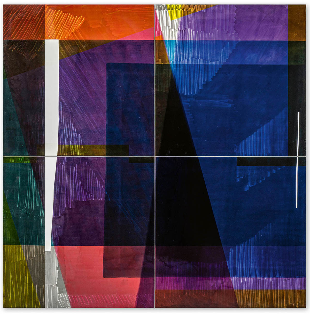
Several educational and outreach formats accompany the exhibition: guided tours and other programs. Tell us more about it?
The exhibition is on view until September 27th. I said before that our building’s lovely central passage is where the open-air cinema takes place. It’s not entirely open-air since it’s under that roofed skylight structure; at least we’re protected from rain. In a few days, we’re showing a film about the artist couple Münter & Kandinsky. The Art & Music program features a jazz ensemble that creates original music in response to selected artworks in the exhibition, accompanied by an art historian who provides context and expertise. It creates a dialogue between the art-historical expert perspective and the musical interpretation. That’s a popular format with us. More classically, we offer free public guided tours open to anyone who wants to join.
Current exhibitions at Museum Ritter:
Exhibition: Heavy Metal. Works from the Marli Hoppe-Ritter Collection curated by Marli Hoppe-Ritter and Hsiaosung Kok
Exhibition duration: 17 May to 27 September 2026
With works by: Sonja Alhäuser, Getulio Alviani, César Andrade, Kirstin Arndt, Bernard Aubertin, David Bill, Hartmut Böhm, Dadamaino, Sébastien de Ganay, Madeleine Dietz, Henrik Eiben, Stefan Faas, Gerhard Frömel, Erich Hauser, Vanessa Henn, Ewerdt Hilgemann, Mohammed Kazem, Imi Knoebel, Jim Lambie, Camill Leberer, Thomas Lenk, Adolf Luther, Heinz Mack, Christian Megert, Gerold Miller, François Morellet, Ben Muthofer, Otto Piene, Thomas Rentmeister, Dieter Roth, Rolf Schneider, Heiner Thiel, Manuela Tirler, Wolfram Ullrich, Günther Uecker, Timm Ulrichs, Gabriele Devecchi, Günter Wagner, Martin Willing, and Beat Zoderer
Exhibition: Marguerite Hersberger – Interspaces
Exhibition duration: 17 May to 27 September 2026
Address and contact:
Museum Ritter
Alfred-Ritter-Straße 27
71111 Waldenbuch, Germany
www.museum-ritter.de
View all upcoming events here.
The museum presents works from the Marli Hoppe-Ritter Collection in changing exhibitions and mounts solo shows featuring outstanding artists. The collection comprises more than 1200 paintings, objects, sculptures, works on paper, and examples of light art and kinetic art. It brings together a large number of artistic concepts that all address the figure of the square, and in this way presents a whole century of art history in concentrated form. Choosing this central theme has enabled the development of constructive-concrete art to be traced out in exemplary fashion, from its beginnings to the present day. The embrace of the collection ranges from historical approaches, such as Russian Suprematism, the Dutch De Stijl group, the Bauhaus, and international Constructivism, via the mathematical rigors of the Zurich Concretists, post-war Op art, kinetic art, and Minimalism to present-day constructivist paradigms. As a private institution, Museum Ritter is funded by the Marli Hoppe-Ritter Foundation for the Promotion of Art. With a constantly changing programme of exhibitions and a wide range of accompanying events, it has set itself the goal of bringing the Marli Hoppe-Ritter Collection to a wide audience. Public art tours are offered every Sunday and on public holidays. An English audioguide is available. In addition, the Museum regularly offers guided tours by the curators, discussions with artists, music events and cinema screenings. Readings, talks, and creativity workshops for young and old round off the programme. Children and under-18s are admitted to the exhibitions free of charge. Its two stories provide 700 square metres of exhibition space. Vis-à-vis the museum is the Bunte Schokowelt run by Ritter Sport, featuring a shop, an exhibition on the brand’s history, and spaces for holding workshops.