

Based in St. Louis, Missouri, you exhibit worldwide; the exhibition at HALLE FÜR KUNST Steiermark is your first solo institutional show in Europe. Could you tell us how this invitation came about?
I was introduced to HALLE FÜR KUNST Steiermark by Phil Grauer from CANADA Gallery. He visited the exhibition by Katherine Bradford titled American Odyssey in 2024. Bradford is also represented by CANADA Gallery, as am I; this is how the connection came about. Since last year, I have been working on selecting the works for the exhibition, as well as working on a model of the space at HALLE FÜR KUNST.
Are you going to be in Graz for the setup of the exhibition and the opening?
I’ll fly into Austria and head straight to Vienna to see the group exhibition KAWS. Art & Comix at the Albertina, since my work will be on view there as well. From there, I’ll take the train to Graz to work on the exhibition setup.
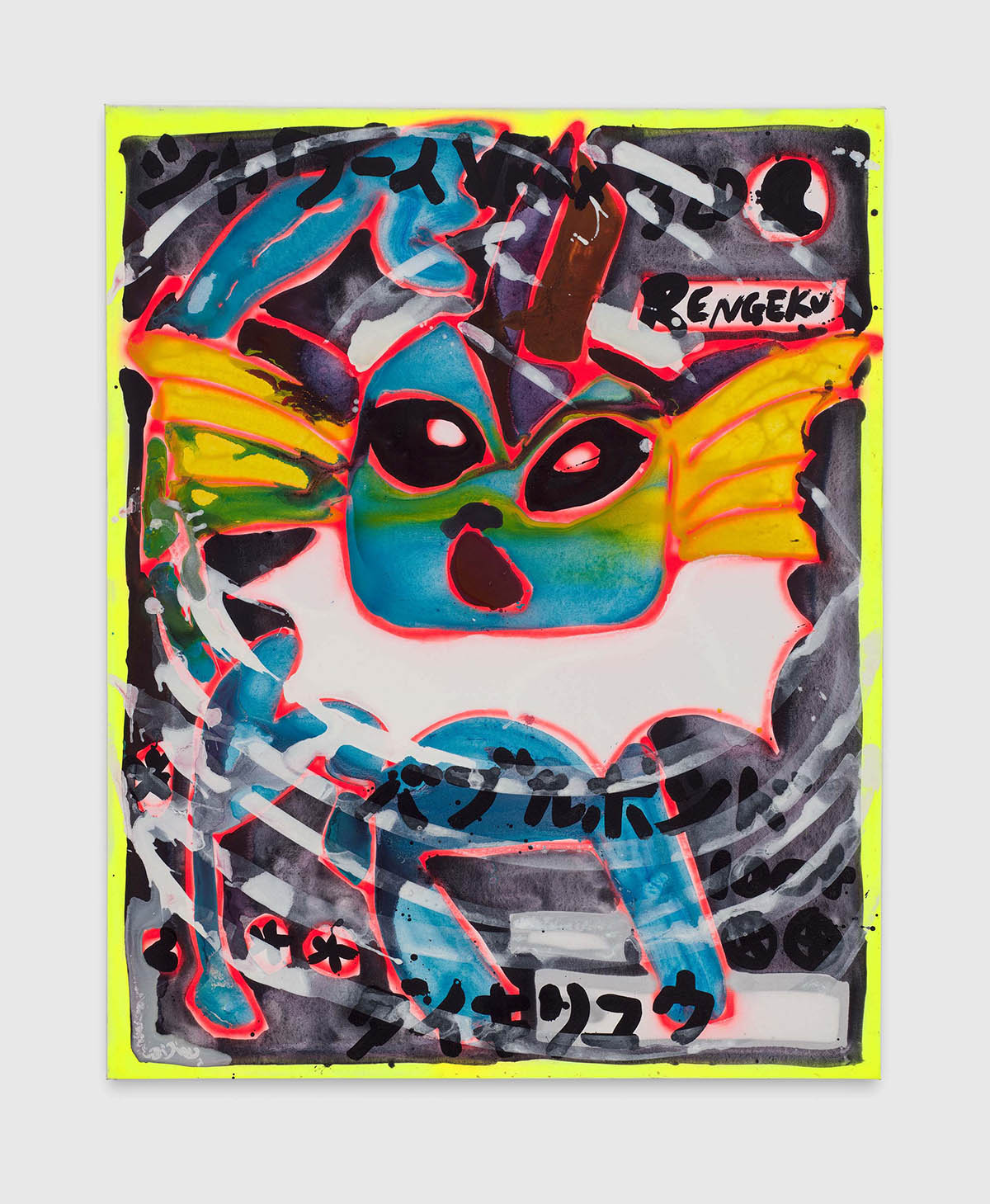
In one of the rooms in HALLE FÜR KUNST Steiermark the wall behind the paintings is going to be painted completely black, I will paint the wall like outer space with stars and planets. The ET paintings would sit on top of them. I’ll have two days to complete it before the opening.
That’s a busy schedule.
It’s all been planned out on a model of the space already, so everything is pretty much in place and prepared. But, you know, you never know how it looks in reality. But I am sure everything will turn out more than fine, and I am super excited for it.
Is the outer space scene also connected to the title of the exhibition, Neonfarbblendluminanzwuchtgemaeldenetzhautkollisionsgefahr in English: Neon – Farbe (Color) – Blenden (Blinding) – Luminanz (Luminance) – Wucht (Force) – Gemälde (Painting) – Netzhaut (Retinal) – Katastrophe (Collision) – Gefahr (Danger)? I feel the title represents a lot of star, outer-space qualities.
I am exhibiting a selection of the works from the past five years, so it’s lots of different paintings and themes that I painted before. So I asked myself, what can I do regarding the title? And my sister said, „Oh, make up a super long German word.” That was a great idea. So I put in all the words I wanted to add, the words that represent the exhibitions. And I asked AI to create the word out of all of them. When the word Neonfarbblendluminanzwuchtgemaeldenetzhautkollisionsgefahr popped up, I thought it was hilarious. I loved it, so that’s what it is in the end.
In German, there is even a word with 80 letters. The title of the exhibition definitely flirts with the fact that the exhibition takes place in Austria. Will any works have never been shown before?
Oh, yes, a lot of them. Most of them. There is one work in the exhibition that was shown before. All other works have never been shown; they were in my studio or storage until now.
You are known for your large-format paintings. Which formats are we going to see in this exhibition?
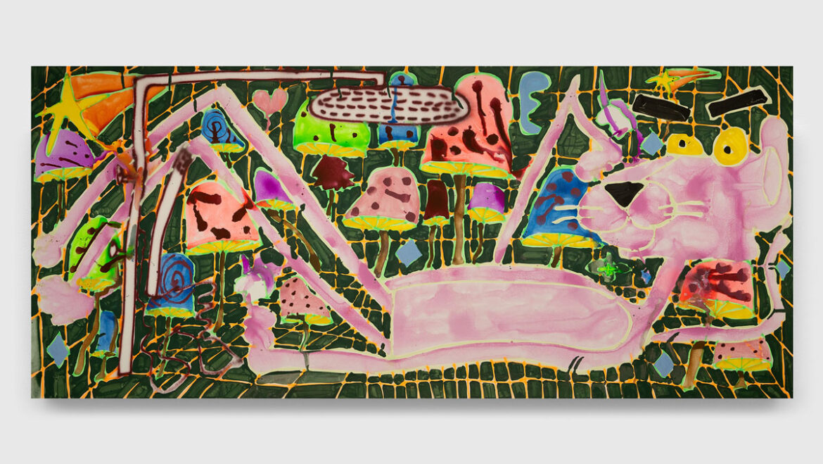
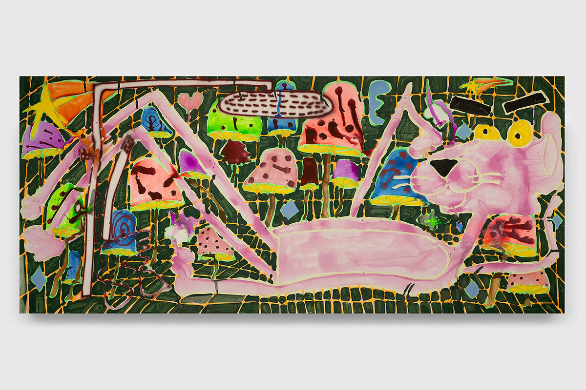
It’s going to be a lot of large-scale works, and fewer of, let’s say, smaller. The biggest is around 25 feet (7,62 m) long. And then there are lots of 8-by-10-foot (around 2,5 m by 3 m) paintings, some that are 5 by 6 feet (1,5 m x 1,8 m), and some that are a bit smaller.
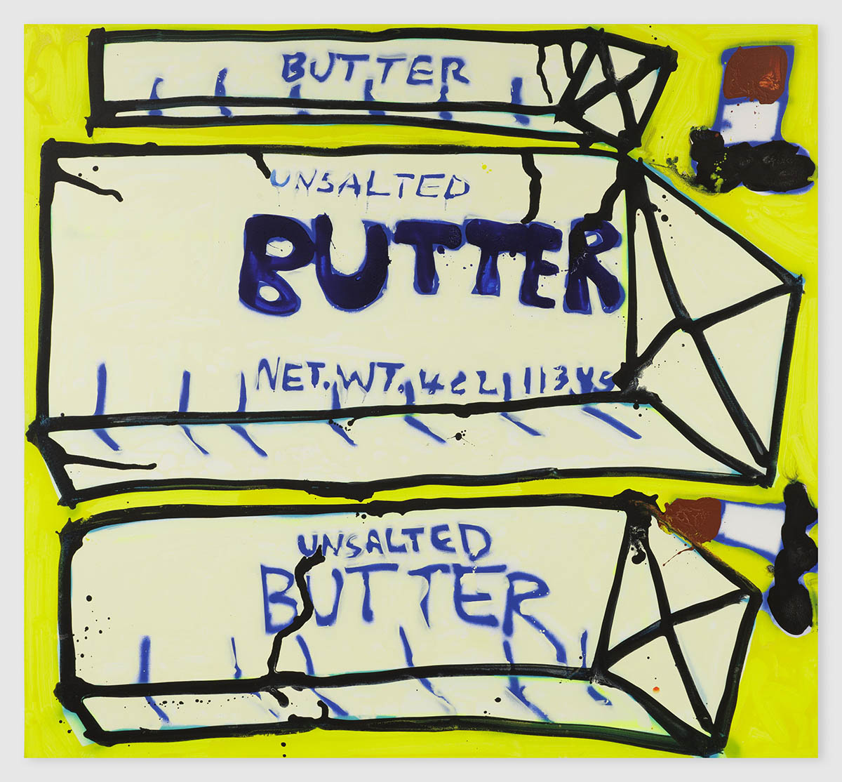
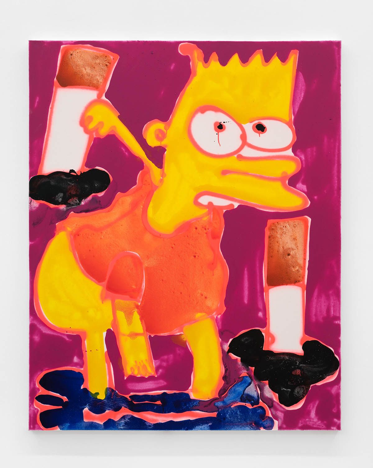
Given the recurring focus on logos, food, and fashion accessories in your body of work, are there any motifs in the exhibition that could be perceived as distinctly Austrian?
I tried to play with ideas of Arnold Schwarzenegger, Austrian symbols, or flags. And it wasn’t working. And I was like, I’m not going to do that.
I guess I paint things the way they are. I paint them in a way that they are readable to everyone.
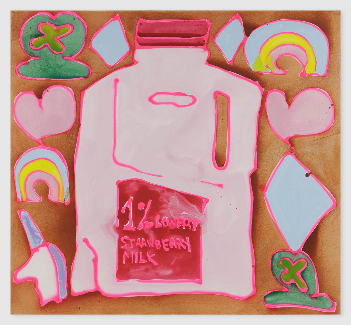
I like painting food: hamburgers, tacos, French fries, smoothies, matcha, pizza, hot dogs, and those very New York things. But then I did a show in Belgium a while ago, and I tried to make things that were Belgian in my mind. So I painted things like Smurfs, chocolates, and waffles. So it happened before that I worked with things specific to certain areas or places; like in California, I had an exhibition with paintings depicting Apple computers, smoothies, and running shoes.
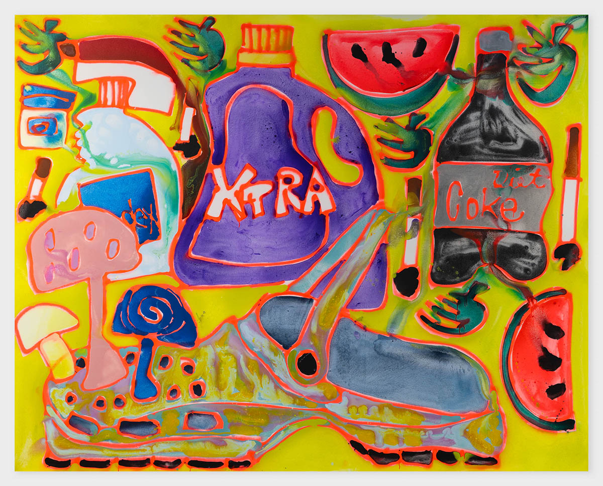
There is a notion of consumerism in the motifs that appear in your paintings. A lot of repetition is happening inside of your work. Do you think that this repetition of the same motif makes the motif’s possible message stronger and more memorable? Or do you think that when it’s painted once, it tells enough?
For me, repeating it over and over and over makes it stronger. That’s how I work. That’s what I do anyway. I’m never happy with one thing. I always think I am doing this now, and then while I’m painting, I’ll already have the next idea for the next painting or what I want to do next.
My work is never truly finished. It’s infinite, in a sense. I can always create new combinations, add new elements, and the results will always be something completely new.
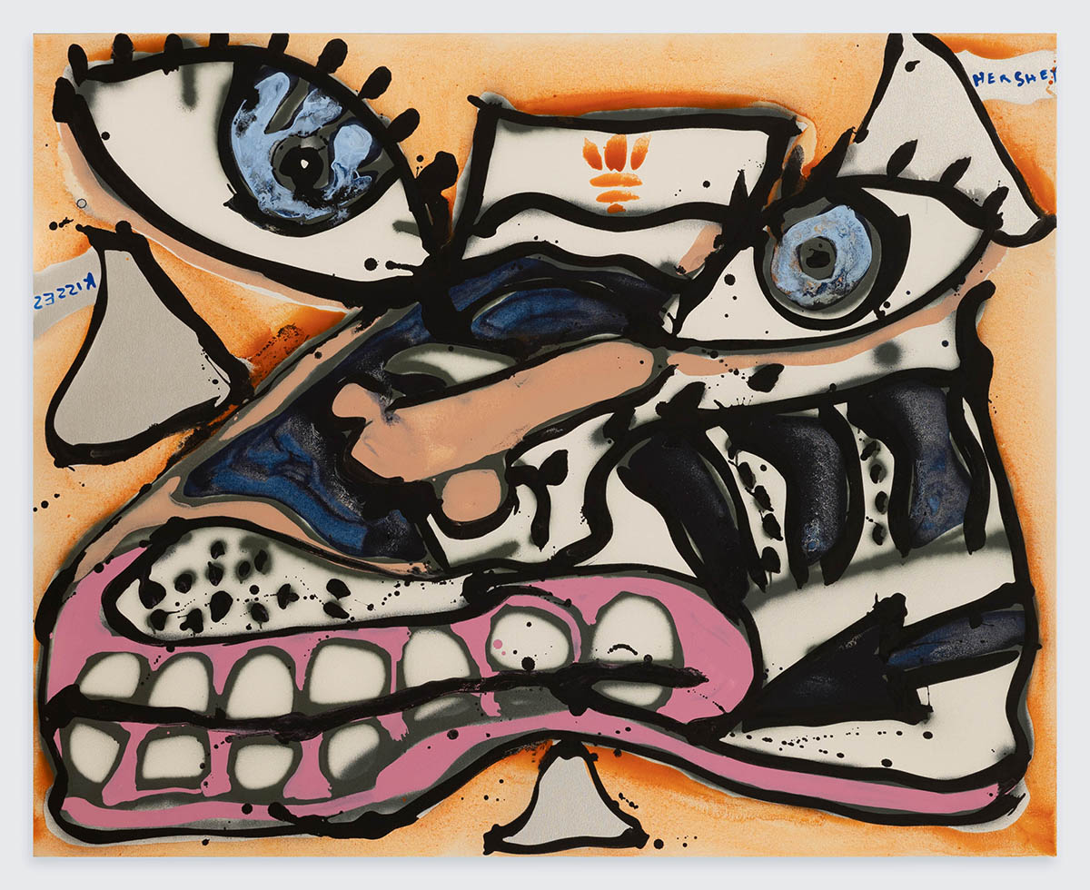
In that sense, the work becomes an endless series, each piece a new „episode,“ yet always recognizable through its signature look.
Everyone has their handwriting style. I have a “style” of drawing, I guess. And I guess it’s my handwriting that makes it recognizable.
Every single painting that a person makes is a self-portrait.
Once you said that art is therapy for you, can you elaborate on that?
I feel like going to the studio is a way to release anxiety, basically. So going in there, having the freedom to do what you want, playing music, even singing, is for me the way to get rid of anxiety.
Let’s go back for a second, in the time of your studies. Do you feel there was some turning point for you where you, like, found your voice and found the exact way of doing things, and how did that happen?
I was at a summer program at New York University. This was in my undergraduate years. I was probably nineteen or twenty years old. Back then, I was making these „horrible“ paintings that meant nothing; it was nothingness. It was colors without context. I felt that was a total waste of paint and time, basically. The teacher asked me once, “What are you doing? Stop it. What do you like? You need to paint that.“ Something clicked in my brain when he said that. I stopped painting like that immediately and started painting things I liked or was influenced by. So I started painting logos and shoes and clothing. That was definitely the turning point when I started doing what I should be doing, and what I do now.
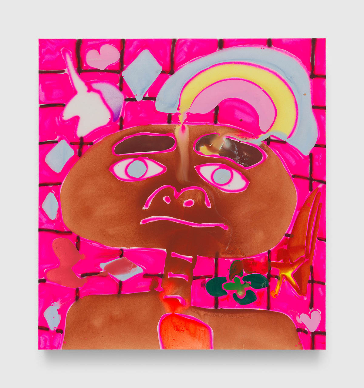
I feel finding the voice is the first step, and then taking care not to lose it on the way; it’s part of it as well.
When I started studying, I didn’t know much about art. I was going to painting class, and I had never been to New York before. I didn’t even know there was a whole contemporary art world happening there. I knew about Claude Monet and Impressionism. I didn’t know you could do it the way you want. That was eye-opening: going to New York, seeing what people are doing, and coming to the realization that you can actually do anything you want. And it’s contemporary art.
Do you think that’s good?
Yes, I’d say so.
In contemporary art you can do whatever you want. But it has to be unique. It has to be unique and interesting. And you need to be deeply interested in the things your work is dealing with.
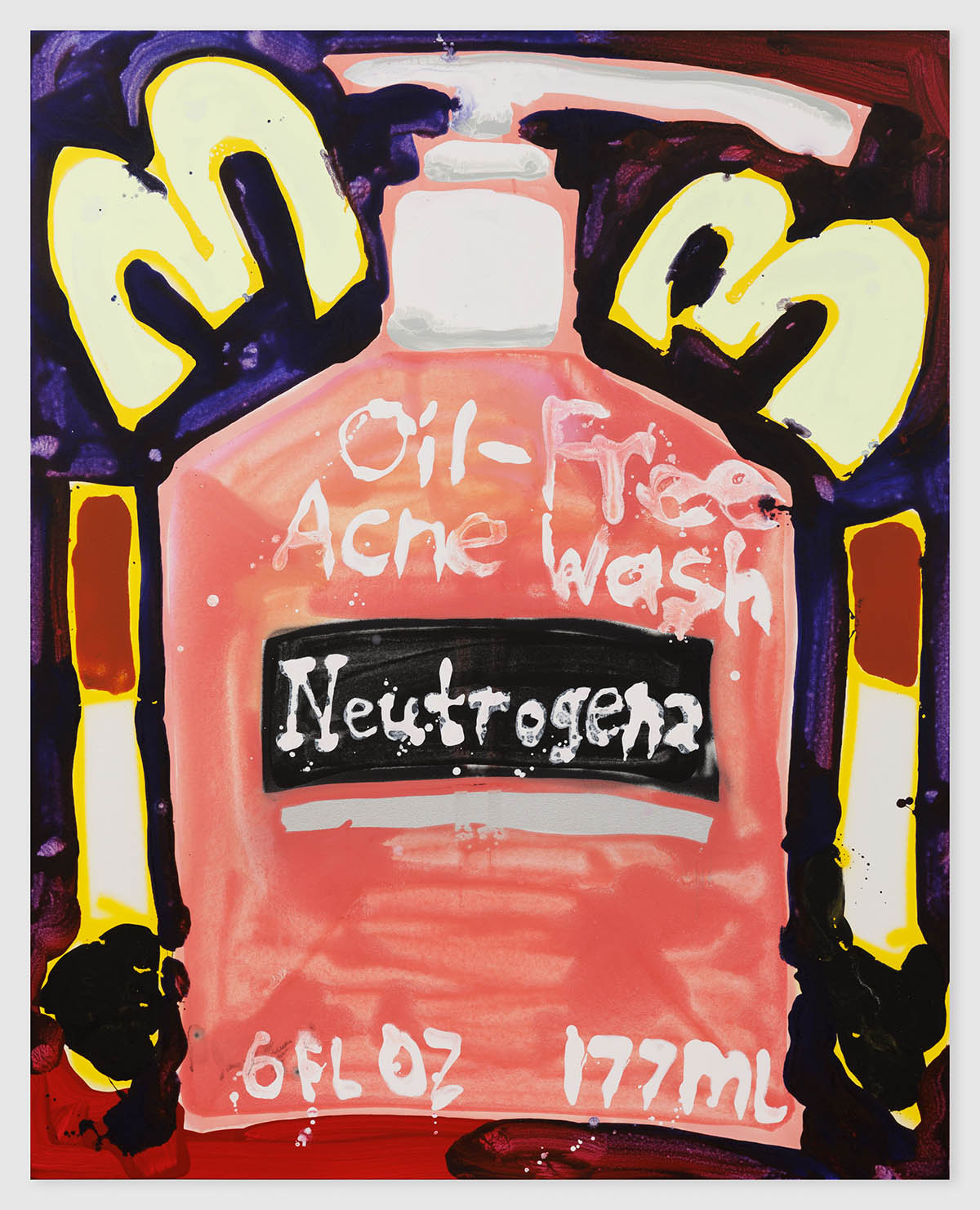
I like one series of works. It’s a little bit older, and it’s pages from the editorials, from fashion magazines. You painted models. How are you dealing with images and beauty standards in culture today?
Honestly, I never thought about anything like that. I was l pulling pages out of a magazine and, in a way, copying them by producing my images out of them. In a material way painting from this series are different, with thicker paint; I painted them upright. There was no spray paint and no working on the floor like now. But I wasn’t thinking about any of those issues. I was doing it. And then people interpret it.
How do you feel when you hear people interpreting your work?
People usually say things that I guess subconsciously I’m thinking about. The stuff I don’t know how to put it in words, and they do. So that is great.
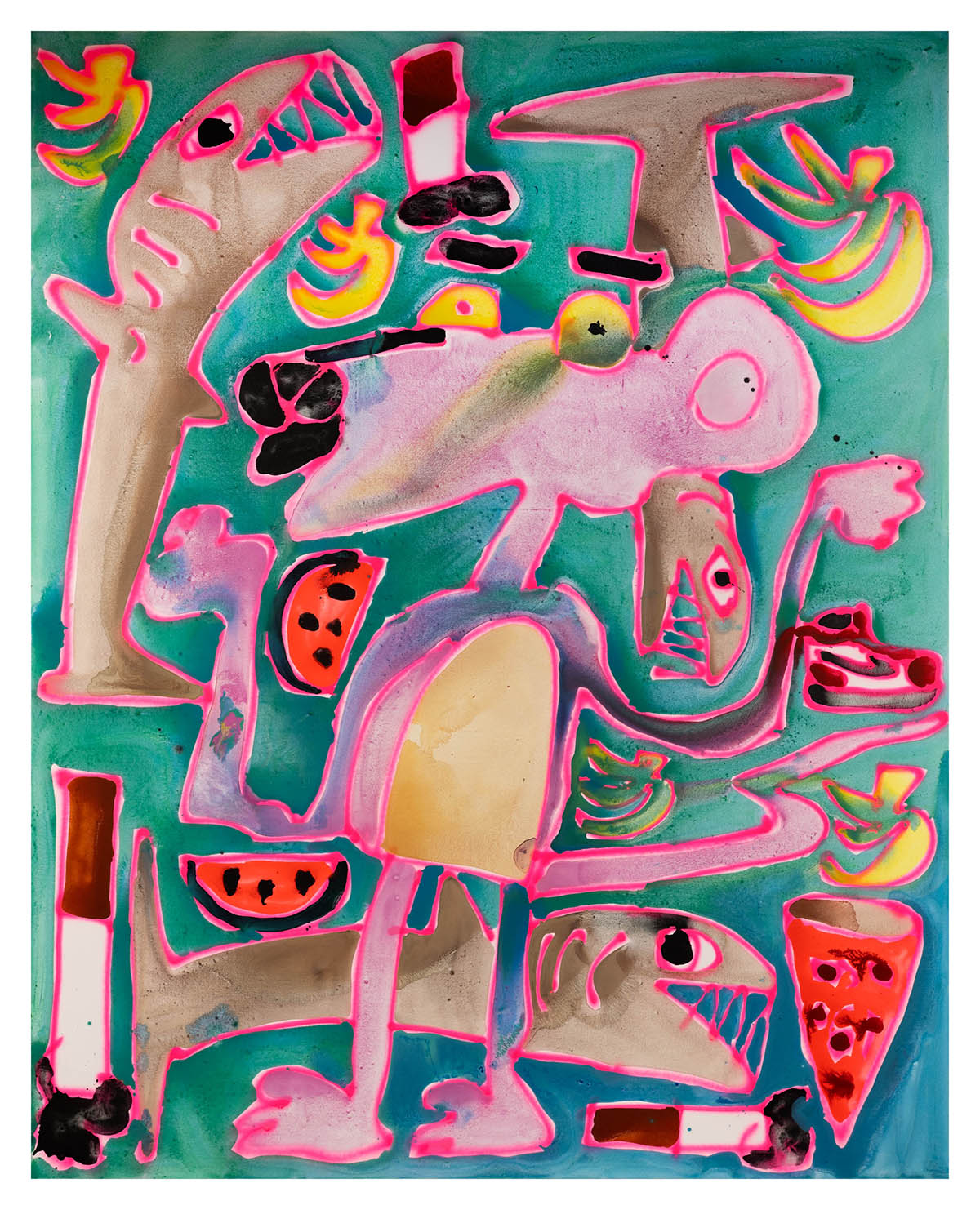
That is exactly what painting is. Something that needs to be expressed through another form without being said or written. Let’s talk about colors.
I like the neon, the neon outlines, the neon green, the neon pink, and neon orange and red. I’ve always been attracted to the ‚ 80s. I love anything ’80s. Everything in my house is 80s, literally.
Music as well?
Oh, I love Madonna, The Cure, The Smiths. Billy Idol. Cyndi Lauper.
When I think of the 80s, I think of freedom. From this distance in time, we could romanticize the decade. Do you have this nostalgic feeling connected to the 80s?
I guess I love the 80s because there were so many things that were impressionable on me when I was little, like Swatch Watches, Garfield, or the Esprit logo. I always loved the Benetton advertisement. Maybe the juxtaposition of the pattern paintings that are very 80s. The supermodels as well, but they are more ’90s. Well, the whole fantasy about it was a product of what happened in the 80s.
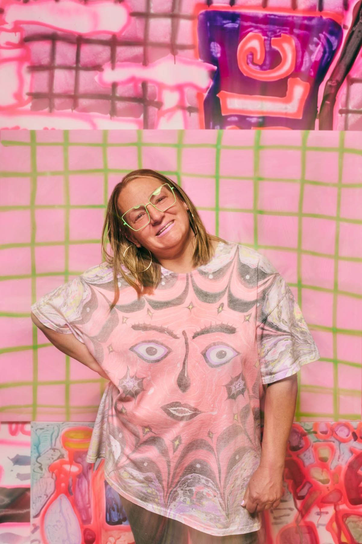
Your work also appears on wearable garments, like T-shirts and hoodies. How do you see this more applied, everyday side of your work? What is your connection to fashion now?
A T-shirt or a hoodie is another surface. It’s another place where an image can live and move through the world. I like the idea of someone wearing a painting to the grocery store or on the subway. It makes the work part of everyday life instead of something that only exists inside a gallery. I’ve always been interested in images that people already have a relationship with—things from pop culture, food, cartoons, and sneakers. Clothing feels similar because it’s something everyone interacts with every day. There’s something funny and exciting about taking an image that started on a huge canvas and seeing it on someone’s hoodie. I like that clothes let the work travel. Someone who might never walk into a museum can still encounter the imagery in a completely different context. I think that’s exciting because art doesn’t have to stay precious. It can be lived in, worn out, washed, and become part of someone’s daily routine.
Is there a particular work of yours that was shown in an environment that holds special meaning for you: a space you feel especially connected to?
A space that feels special to me is my sister’s house in Italy. I painted the walls of her kitchen, bathroom, laundry room, living room, and staircase. It’s a total installation of murals and living with art. Art murals surround the daily living space. The space itself is cool because it is a converted carriage house. The building itself is called ‚barchessa,‘ meaning an affiliated building of the main villa, outside Bologna, Italy. The building is from 1711.
Solo exhibition: Katherine Bernhardt – Neonfarbblendluminanzwuchtgemaeldenetzhautkollisionsgefahr
Curator: Sandro Droschl
Opening: 23 September 2026, 6:00–9:00 PM
Exhibition Duration: 24 September 2026–10 January 2027
Opening Hours: Tuesday–Sunday, 10:00 AM–6:00 PM
Address and contact:
HALLE FÜR KUNST Steiermark
Burgring 2, 8010 Graz, Austria
www.halle-fuer-kunst.at
More about the exhibition: www.halle-fuer-kunst.at/en/exhibitions
Katherine Bernhardt – www.instagram.com/kbernhardt2014
Katherine Bernhardt’s (*1975 St. Louis, Missouri, lives in St. Louis) work operates at the intersection of Pop Art, Neo-Expressionism, and post-digital painting. She draws on the strategies of 1960s Pop Art, as developed by artists such as Andy Warhol, Roy Lichtenstein, and Claes Oldenburg, translating their visual vocabularies into a subjective and expressive contemporary language. Unlike the calculated detachment of classical Pop Art, Bernhardt’s paintings are characterized by gestural immediacy, spontaneity, and a deliberately imperfect openness. Her work also reveals affinities with the Neo-Expressionism of the 1980s. Solo exhibitions (selection): Canada, New York (2026), David Zwirner, Los Angeles (2025), Gangneung Art Museum Sorol, Gangwon-do, South Korea (2025), Hangaram Art Museum, Seoul Arts Center, Seoul (2025), Nerman Museum of Contemporary Art, Overland Park, Kansas (2025, with Jeremy Scott), David Zwirner, Hong Kong (2023), Canada, New York (2023), David Zwirner, London (2022), Diablo Rosso, Panama (2021).
HALLE FÜR KUNST is an innovative exhibition venue for contemporary and modern art production in an international context. At the same time, the program also recognizes regional art production. With these different perspectives, HALLE FÜR KUNST Steiermark sees itself as a communicative institution that addresses the international within the context of the local. Using the various formats of solo exhibitions and thematic group shows, performances, and residencies, the curatorial team wishes to react directly to the manifold forms of expression in contemporary art production and to offer a space open for the resonance of relevant discussions. The late-modernist architecture of the building (1952) and the surrounding park offer a special setting, and this physical space is complemented by the website in the form of a platform that reflects and disseminates our many different focuses and artistic productions.